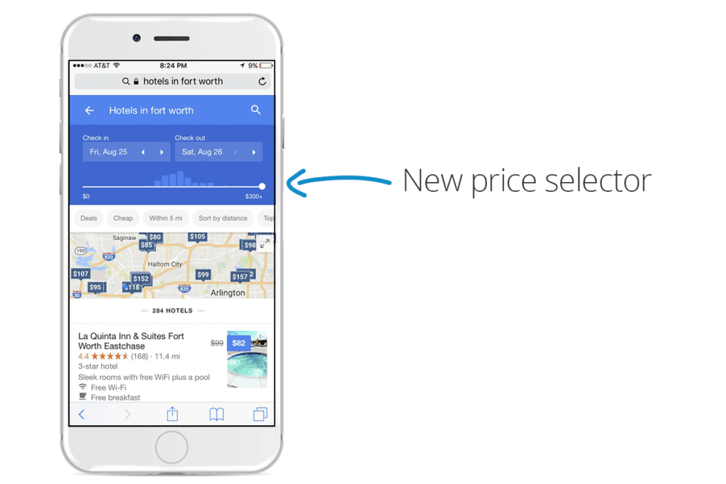
This morning we began to see a new Google Hotel Ads mobile user experience being tested. The user interface has a new sliding scale for price selection above the filters for specific amenities, and the date selection has received a face lift.
NB: This is an article by Koddi
Here is an example of what this new experience looks like:


For a limited percentage of mobile traffic, individuals are given the option to select the price range that they are interested in via a sliding scale. This allows mobile users to more easily define what they are looking for in lodging.
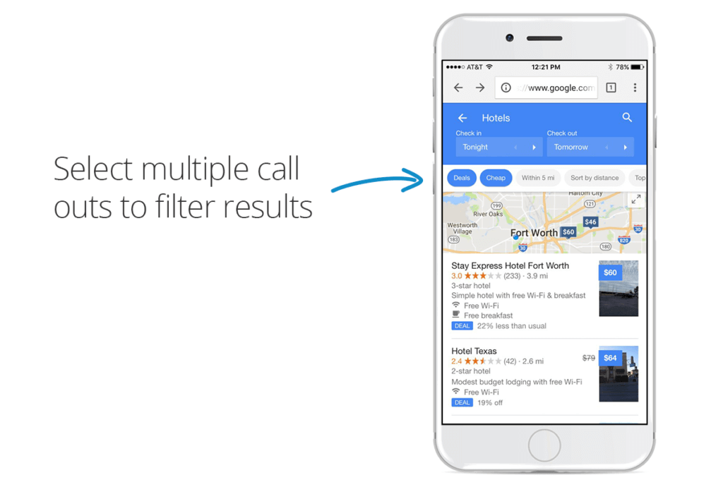
The landing page that is shown for mobile users also has a clickable call out for filtering your results to show only properties that have the specific factors that you are looking for. After selecting the call outs, the list and map are updated to reflect properties that fit your criteria. For example, if I were to do a generic search for ‘Hotels in Fort Worth’, and then click the “Deals” and “Cheap” call outs, I would see the following results:

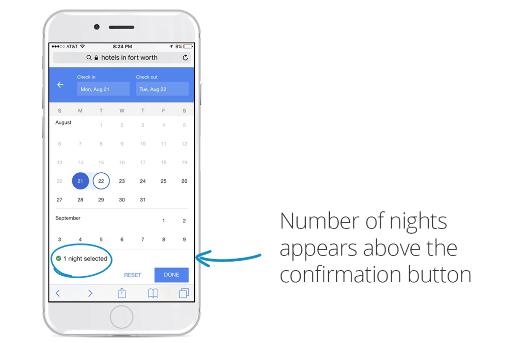
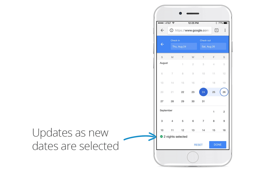
When selecting your check in and check out date, Google now includes a call out to how many nights you have selected. In the above example, we have selected a 1-day stay length, but this value updates as you change the check in/check out date:

As always, Google is constantly testing new features and user flows for Hotel Ads in order to give the best user experience possible. With this increased focus on directing mobile users to the correct property and page, it will be interesting to see the impact it has on mobile CVR. Coupling this new UX with the new default date logic, it is apparent that Google is highly prioritizing having the most seamless mobile user experience possible.


