

Making a strong first impression is essential to start your guests’ online booking journey on a positive note. Since their experience begins with your hotel website, the messages displayed should be engaging and the design visually compelling.
NB: This is an article from The Hotels Network, one of our Expert Partners
Subscribe to our weekly newsletter and stay up to date
With the tips in this blog, you can impress your guests with a topnotch online experience. For a deeper dive, our Hotel Website Messaging Design Guide offers even more strategies to inspire your next update.
Design Harmony: Keeping Your Website Balanced
Colors That Speak Your Brand
Your color palette represents your brand identity and makes your guests recognize you easily. Consistency is key, using your brand colors across the site creates a unified look and feel. All marketing messages and graphical elements on your website should align with this scheme to strengthen recognition and trust.
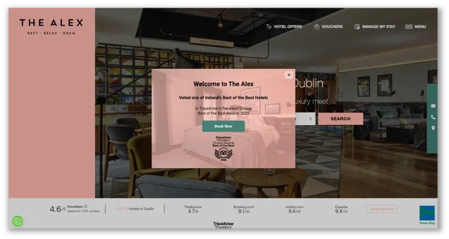
Importance of Respecting the Color Scheme
Readability First: Clear Text, Clear Impact
If your message cannot be read, it’s far less likely it will resonate with your audience. There are a few key points to keep in mind when designing your website. The most important thing to consider is choosing contrasting colors for text. Using colors in contrast will help you deliver your message clearly.

Example of Contrasting Colors
Font selection matters as well. The fonts that you choose should match your brand’s personality and be harmonious. Limit yourself to three fonts, and use bold or italics when needed. This keeps your design professional and appealing.
Do not try to use all of the space you have, keep your design simple with white space. When a banner is overloaded with elements, the message becomes unclear and users are likely to ignore it. A clean, minimal layout helps guide attention to the most important message and creates a more professional look.
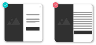
Example of White Space Usage
Scale and hierarchy are powerful design tools that guide the viewer’s eyes to what matters most. Enlarging key elements draws attention and helps users quickly grasp the main message. Hierarchy applies not only to text but also to images, graphics, and layout choices. Color is another simple way to highlight details, making calls-to-action stand out and encouraging interaction. Used together, these techniques create clear, engaging designs that are easy to navigate.