
For two years now, Google has been using the mobile-friendliness of a website as a method for deciding how web pages should rank in their search engine.
Pages that were easy to use and looked great, regardless as to whether the user was browsing on a desktop computer, laptop, tablet or smartphone, began to rank higher in the search engine.
What began as a minor “ranking factor” is being given an increasing amount of weight – today. Hotels with websites that work perfectly across devices are ranking higher in Google than ever.
During 2016, half of online travel bookings were made on mobile devices, expected to increase to 70% by 2019.
Put two and two together and you have a competitive edge. While hotel websites, not optimized for mobile devices, are pushing prospective guests away, your mobile-friendly website works harder and Google will give you a larger piece of the pie.
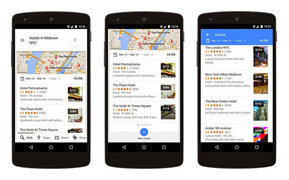
Google is helping businesses catering to mobile users
Many savvy hotel marketers rushed to improve their website to be mobile-friendly after the initial algorithm update. When a larger boost was given to those making Google happy, early adopters reaped the rewards, receiving a much larger portion of search traffic for users on mobile devices.
Late 2016 was the game changer, as Google introduced “mobile-first indexing“; regardless of what device the user is on, mobile-friendly websites came first. Bing followed suit.
So while your hotel’s website may look incredible on a desktop computer, if it looks bad on mobile, it’s unlikely Google will show it on page one (or three).
Responsive web design
Responsive web design allows web pages to be viewed in response to the size of the device the user is browsing your website with, whether it’s mobile, tablet, laptop, desktop and even larger screens.