Our metasearch partners have been devoting an increasing amount of effort to improving and testing new user experiences.
NB: This is an article from Koddi
Lately, we noticed a new auction experience on Trivago across several browsers. While this test seems to be available only in a handful of countries, it could mean changes are coming to other Trivago users soon.
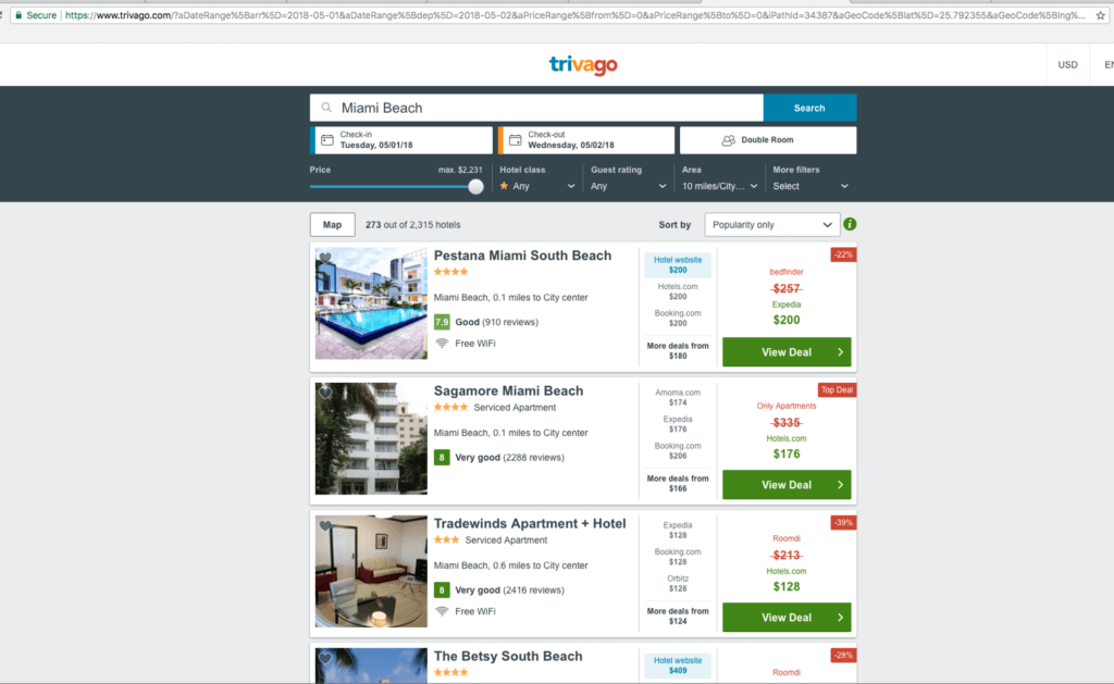
Below is the Trivago auction experience that travelers are most likely familiar with, displaying four advertisers at the same time with a button of “More deals from” for them to click through to view additional advertisers. As Trivago’s auction dynamic is a first-price auction, typically, the advertiser with the more competitive rate and a competitive-enough CPC would be boosted to position #1. In addition, hoteliers are granted the “blue placement” with a “Hotel website” callout, which drives additional attention for travelers who prefer to book directly with hotel chains.
New Display Shows Only One Advertiser
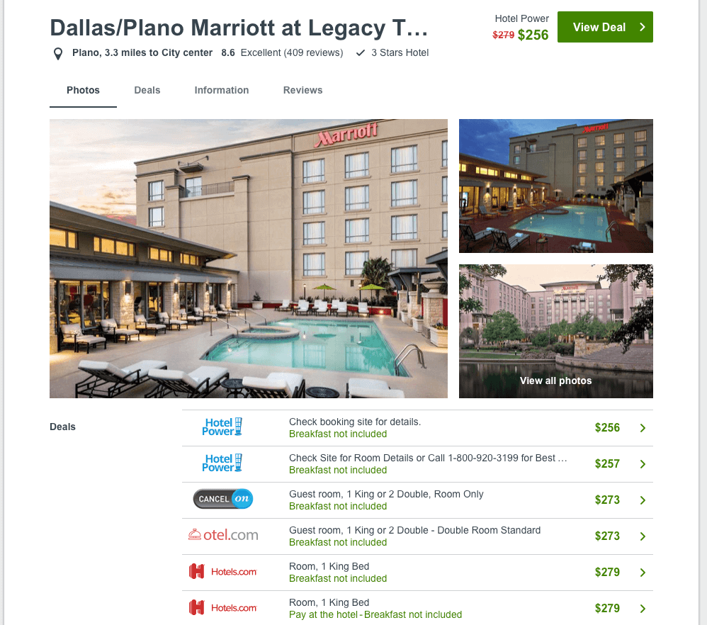
Here’s the UI test that we noticed recently, which displays only one advertiser. In most cases, this appears to be the advertiser with the more competitive rate and a competitive-enough CPC (equal to the advertiser who won position #1 in the original experience above).

Second Tab for Travelers to Browse Other Options
Since other advertisers are not shown in this test, if travelers would like to see other options to book, they have to click on the hotel name or the “map pin” below the hotel image, which directs them to a second tab with a list of other advertisers, as shown below. We also came across some instances where there is no map pin available at all, leaving travelers only one option to book through. In this case, the advertiser who won the first position will be the only advertiser shown in the subsequent auction.

Filters Moved to the Top of the Page
One of our analysts came across an experience that appears to be a test for an update to the search results page. In the desktop screenshot below, you can see that the filter menu is now on the top of the results page instead of the left sidebar location where it normally appears. This updated UI closely mirrors the user experience on mobile, and the design also scales easily for smaller desktop windows. We only came across this UI once, so it seems to be a test on a smaller audience. It will be interesting to see if this experiment leads to more permanent UI updates from Trivago.

How Does this Impact Metasearch Campaigns?
We noticed that the auction place tests seems to only be live for users in the US and in some key European markets, such as France, Germany, and the UK, and our team only came across the UI update on one occasion. Since we are not certain about the percentage of traffic being tested, it’s too early to jump to conclusions about the impact on metasearch campaigns. As publishers are constantly experimenting on their sites to scale efficiency and improve the user experience, it is crucial to pay close attention to metasearch campaigns and to stay on top of the latest trends and market updates.


