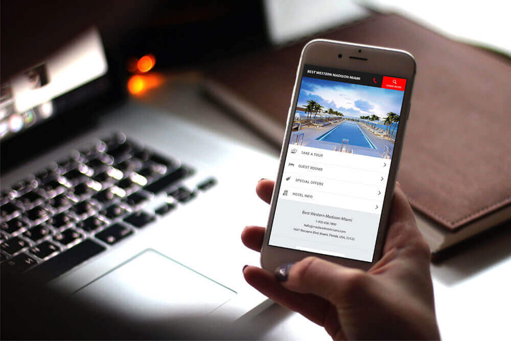
Everybody is talking about the rise of mobile bookings. In fact, a study by eMarketer estimates that by 2021, half of all digital travel sales will be made from smartphones or tablets.
NB: This is an article by Tambourine
Chris Bendtsen, an eMarketer forecasting analyst, told Travel Weekly that consumers are booking more travel plans on their smartphones and tablets for a variety of reasons:
- Easier methods of online payment.
- Larger smartphone screens.
- A desire to react quickly to last-minute travel deals.
So why aren’t your mobile bookings growing as rapidly as the rest of the world?
Too many hoteliers may think a mobile version of their website & booking engine will suffice. However, today’s consumers are not just looking for your website to ‘come up’ on their phones. Your smartphone experience has to match today’s modern consumer habits and expectations.
Mobile bookings are the present and the future of the hotel industry. Here are the three smartphone booking tweaks you need to adjust to this new reality and outperform your compset:
1. Cut it Down
Real estate on a mobile screen is limited.
The first – and most important – step to maximizing the mobile guest experience is to cut out, not add, features. Examine your hotel’s mobile booking funnel and streamline it as much as possible. Strip your mobile site of any clutter, including links, ads, navigation elements, menu options etc. Pare down the booking process to 3 screens or less.
Mobile is meant for the consumer-on-the-go… they have no patience for long-winded, self-indulgent purchase processes! Since mobiles screens are smaller than desktops or laptops, minimize the amount of text on the screen. Trim content down to only what’s necessary to convey (like calls to action or clear next steps), then use a single big visual per page to guide guests through the process.
Multiple photos, videos, and pages of copy will not only make your mobile hotel booking engine load slower, but possibly anger and turn away guests who are accustomed to faster uploads from other sites.
2. Design for Thumbs
Call it modern intuition: smartphone users navigate mobile sites using one hand. Most often with just their thumb. This is why the best mobile hotel ecommerce experiences are built like apps, which allow guests to tap, swipe, scroll, and click using just one hand or thumb. Stay clear of requiring guests to ‘pinch’ the screen to zoom in and out for content. This means your graphics and text are not optimized for mobile users and are too small.
3. Simplify Payment Options
You pride yourself on giving consumers choices in room types, F&B venues, and other add-ons. Your flexibility should extend to the most important element in the customer-acquisition process: the checkout!
Yet, sometimes the simple reason shoppers don’t complete a purchase is that their preferred credit card wasn’t accepted in your booking engine!
Smart hotels offer multiple payment options, going beyond Amex, Visa and Mastercard to include as many forms of payment as possible, including third-party online payment services like PayPal. Some even take it a step further like Couples Resorts, who offer a “loveaway” payment plan. A complicated hotel booking engine process is often the reason guests abandon their reservations, so provide a simple and speedy credit card experience.


