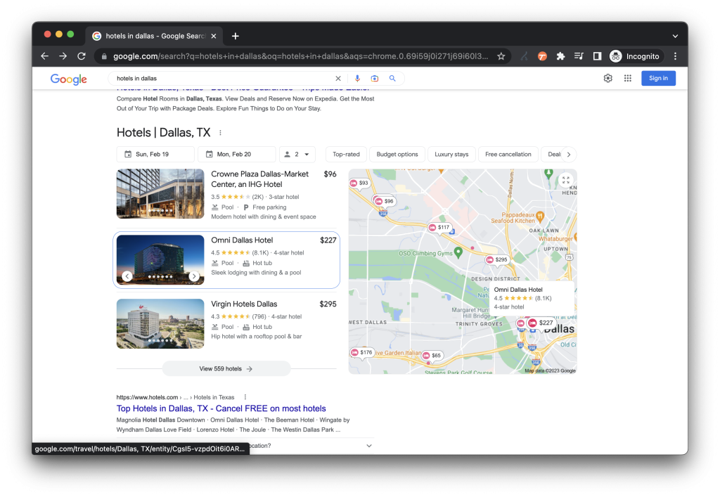
When users search on Google for hotels at a destination, they are typically greeted with a result page that has a mixture of paid search results, organic search links, and the local three-pack that includes three hotels for the destination that they searched for.
NB: This is an article from Koddi
This local three-pack is the entry point for a large percentage of the volume that is driven through Google Hotels Ads. The local three-pack has existed with minimal updates for years.
Subscribe to our weekly newsletter and stay up to date
But now, that user experience and interface appears to be under a test from Google – with a handful of our premier analysts participating to deliver only the best, fastest new insights for our clients.
While the search engine result page (SERP) has not changed in a meaningful way, the next click out is bringing some users to a new UI that has clearly different priorities than the historic set up.
New Set-Up Versus Old Set-Up
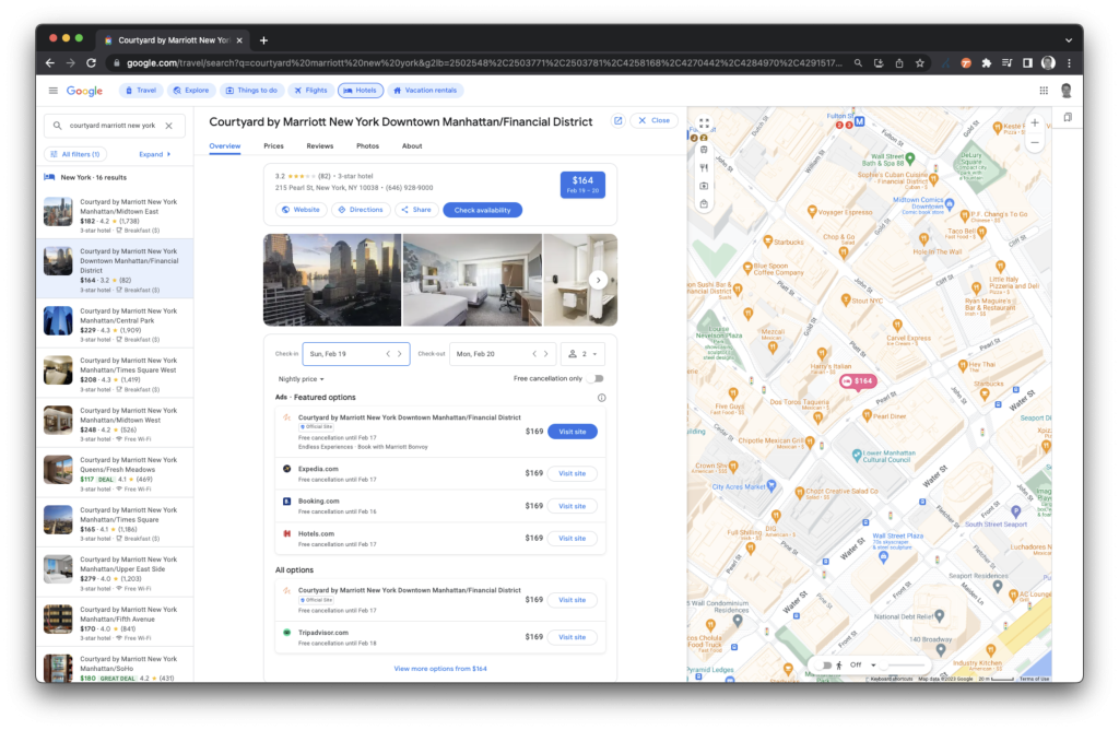
After a user selects a hotel from the three-pack, they may be greeted with a new landing page that has some distinct differences from the historic landing page.
This new landing page prioritizes the hotel’s location on the right-hand rail, shows additional hotels that match their original request on the left-hand side, and gives some minor visual tweaks to the hotel information panel.
These updates to the right-hand rail showing the map are great additions for users that need to ensure that the hotel they are selecting is in the preferred part of the city that they are visiting. Previously, this map was available but slightly hidden under the Location tab of this landing page. This update could give users who are selecting hotels higher intent before they click on any advertiser, as they will be more assured that the location they have selected is in the right location. This also gives the user a better sense of what is surrounding the location. Is it near coffee shops? Shopping? Restaurants? All of these considerations can drive increased intent.
The update on the left-hand rail provides great insight to the user about the price comparison of the location they clicked on compared to hotels that are nearby. Previously, when a user had selected their hotel, the only way to see nearby competitive hotels was scrolling down to the Similar Hotels or People Also Viewed sections, towards the bottom of the listing. This update could influence users to be more selective on Google prior to clicking out to an advertiser.
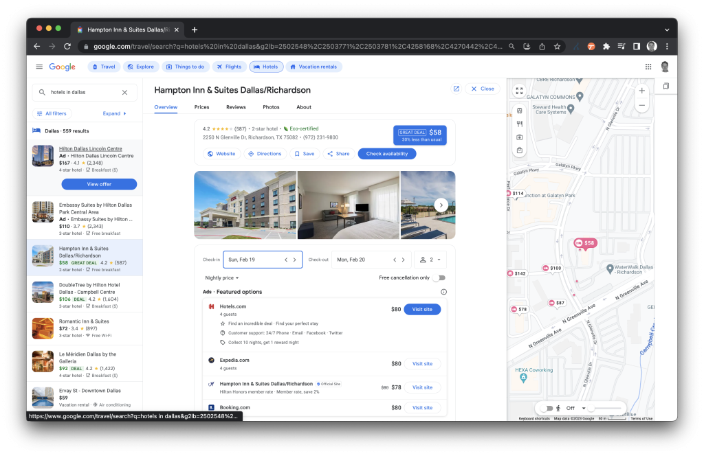
Interestingly, when doing a broad destination search, we see this as an additional entry point for property promotion ads (PPA).
Property Promotion Ads Entry Point
What sets the PPA listings apart from the conventional entry points are the addition of the word “Ad” to the listing, as well as “view offer” instead of “view prices.” This update could potentially add even greater additional volume to property promotion ad listings, which have already been instrumental in Google Hotel Ads search volume growth over the past 24 months.
The update to the actual hotel listing loses some of the prioritization towards imagery, by making the images a bit smaller. There are also fewer new tabs available, as these new tabs have been expanding into what was previously unused white space.
In Conclusion
This new entry point paves the way for higher intent users, greater selectivity among users, higher click-through rates and conversion rates, improved CPC, and more overall PPA traffic. Now is the time for savvy hotel marketers to optimize their strategies to make the most of these new opportunities.


