
You can have the best, most unique, value-for-money offer ever – and yet, if it’s not portrayed the right way, you’re no closer to selling rooms than before the offer even existed.
NB: This is an article from Net Affinity
We’re big fans of a sales and marketing strategy that takes all elements into account – from big to small, marketing to revenue – every area needs to be integrated and covered if you want to be a successful independent hotel with sky high direct bookings. Your landing pages are a seemingly small, yet crucial part of your marketing campaigns and how you go about portraying, communicating and ultimately selling offers.
Subscribe to our weekly newsletter and stay up to date
What is a landing page?
A landing page is a page created for a specific campaign with the goal of turning website visitors into paying customers. Unlike other web-pages, landing pages typically don’t have any links elsewhere – the goal is to drive people to one place that gives them all of the offer info they need and a link to where they can book.
Landing pages should help convert your paid traffic into profitable direct bookings. The simple reason is that your homepage is designed with a more general purpose in mind. It speaks more to your overall brand and is typically loaded with links and navigation to other areas of your site.
That’s why directing paid traffic to your homepage means a user might get overwhelmed with irrelevant information and they’re more likely to leave your site to go elsewhere! Our attention spans as humans are only 8 seconds – use the time wisely.
Landing pages help you to send the right message to the right person at the right time.
So how do you use landing pages to successfully convert people? Here are our top 8 tips.
1. Starting from the beginning
Your landing page is built for a single goal. Don’t include any unnecessary elements that don’t reinforce the main message of your offer. Ditch the header navigation to remove choice fatigue and keep users focused on the task at hand, making it absolutely clear what action they should be taking.
2. Your headline
The perfect headline that quickly grabs your ideal guest’s attention is a good start. If people don’t make it past your headline, there’s no way they’re going to ever hit the “book now” button. Remember you can increase your conversion by 40% by simply tweaking the headline!
To help you decide on your headline types, take a good look at your customer personas. Build a campaign designed to appeal to one or two of them, and then write the headline in language and terms they’ll appreciate.
3. Message Match
A fundamental aspect of successfully converting customers online is by making sure your messages match up between all your different platforms including website, social media, email communication etc. Harking back to attention spans, people don’t have the time, head space or energy to dissect or decipher between mixed messages. In order for them to book, they need to see the same message across the board and they need to see it quite clearly!
Make sure your landing page uses the same headline, benefits and prices as your social ads/email campaigns. Strong message match increases conversions because it reassures people they’ve come to the right place.
4. The visuals or video
Video can improve conversion rates by up to 80%, so if you have strong video assets, we encourage you to use them. If not, visuals are perfect too – just use the right ones. We are visual creatures and tend to be taken with them if they’re the right ones! When you’re choosing your visuals, be mindful of how the colours/style work with your brand. It’s like message matching – you want people to know that this is your hotel, you want to be recognised easily.
5. The benefits
One simple way to ensure that your landing page is more benefit driven is to use the “so what?” test. Simply read through any statements or features about your hotel and ask, “so what?”
Let’s say your hotel landing page makes the following statements:
- Children’s play area
- Close to the sea
Here’s how they become more benefit-driven and pass the “so what?” test:
- Let your kids play safely while you spend time with your significant other.
- A beach right outside your door!
It doesn’t need to be complicated. Start by thinking about your visitor’s needs and how you meet them – then carry on from there.
6. Social proof
If you’re not including some reliable social proof on your hotel landing pages, you’re missing out! We’re more inclined to do something if other people are doing it so make sure you show people how happy your previous guests have been.
7. Call to action
Your call to action is arguably the most important part of your landing page. Are you spending money on a marketing campaign that drives traffic but doesn’t convert? Review your call to action using these 4 points.
1) Text: Is your call to action clear? Does it create a sense of urgency? Is it short and to the point? Does it communicate value?
2) Placement: Is your call to action above the fold? Is it in a logical place where users would most likely take action?
3) Size: Is your button easy to find? Is it too big that is has become a distraction? Is it easily identifiable as a CTA button? Is it sized appropriately for mobile?
4) Color: Does your button visually stand out from the rest of the page? Is there enough white space surrounding it? Have you tested which colours provide you with the most clicks?
Adjusting these four elements can have a significant impact on landing page clicks, and conversions.
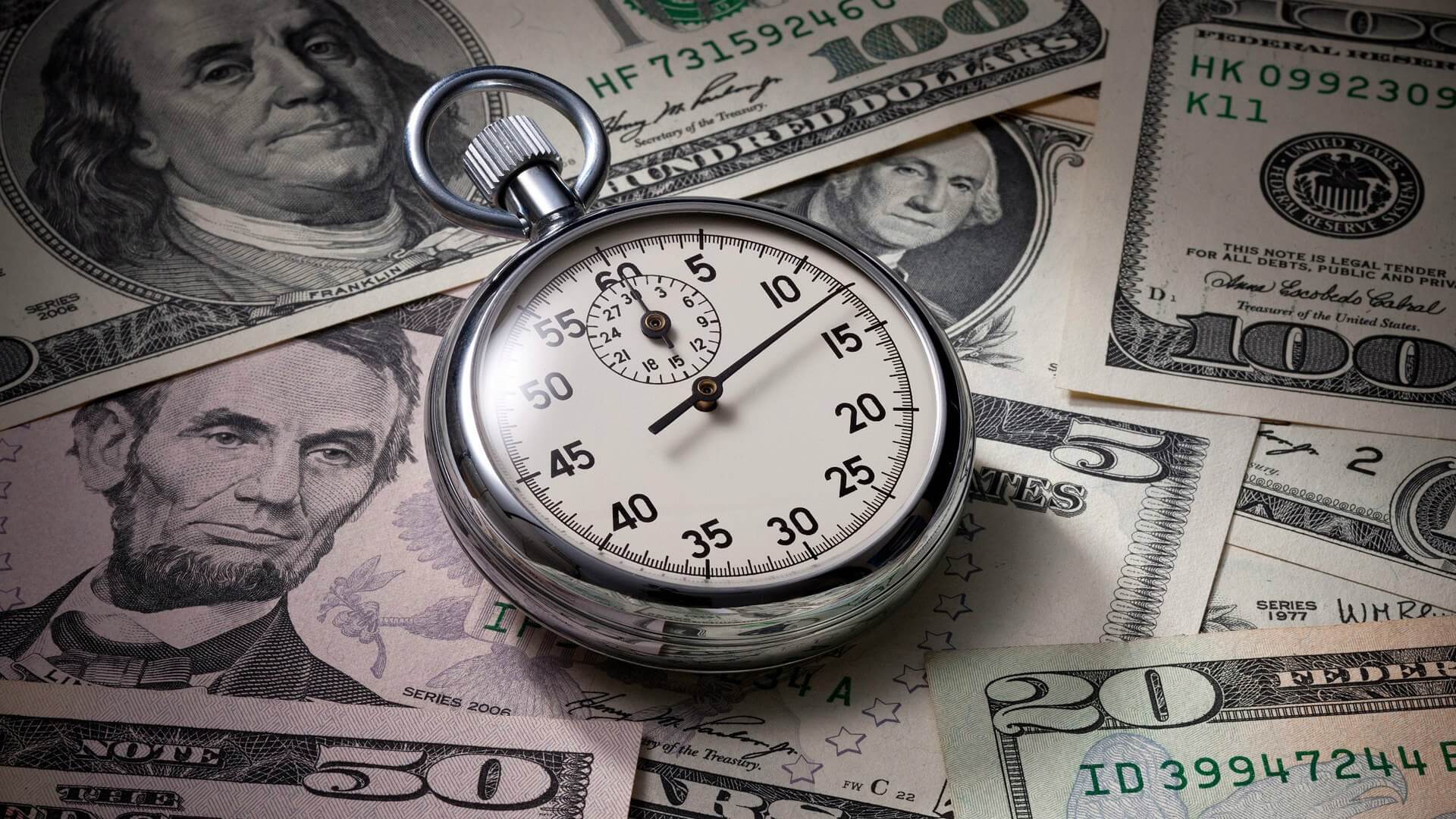
Add a sense of urgency
Adding a sense of urgency can also help to drive conversions. When we realize there’s less of something, we generally want it more!
To highlight urgency, you can display time constraints by telling the reader when the competition or offer will end. Some hotel marketers even add a live countdown timer which displays how much time is left to take part. We are also a big fan of Action Bars – a tool that can be customized with a countdown, a calendar, or text.
Use scarcity to your advantage
Competitions often use scarcity to encourage entrants. Within the copy, they make it clear that there will be only ‘4 lucky couples’ who will win, or they might say there are only 2 coupons available. This shows that the product is scarce and more people will be looking to get in on the action.
8. Testing
Once your page is built, you’ll need to get testing. To get the most from each landing page, know what’s working and what isn’t.
Here’s what to test:
- The main headline
- The call to action (CTA) – typically the text on the button that represents your page’s conversion goal
- The visuals
- Button design. Use design principles to accentuate the appearance of your CTA (contrast, whitespace, size). Above all, try making it bigger
- Button color – green for go, blue for link color, orange or red for emotional reaction
- Form length. For lead capture and other form usage, you may want to test the optimum form length
- Long copy vs. short copy. Often shorter is better, but for some promotions detail is important in the decision making process
Are you using landing pages as part of your hotel marketing strategy?
What benefits have you gained from implementing landing pages?