In a competitive space like metasearch, it’s no surprise to see the top players innovate and make changes to gain the most consumer share. Part of this involves consistently testing new interfaces in an attempt to optimize time on site, conversion rate, and plain old aesthetics.
NB: This is an article from Koddi
We’ve noticed both Kayak and TripAdvisor rolling out or testing new interfaces in the past couple of weeks.
Kayak
We noticed Kayak testing a particularly interesting revamped UI recently. Here’s a look at the current design, followed by the updated one we noticed a few days ago:
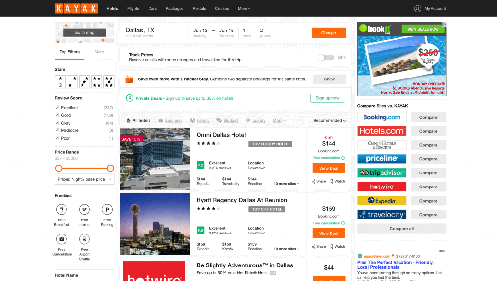
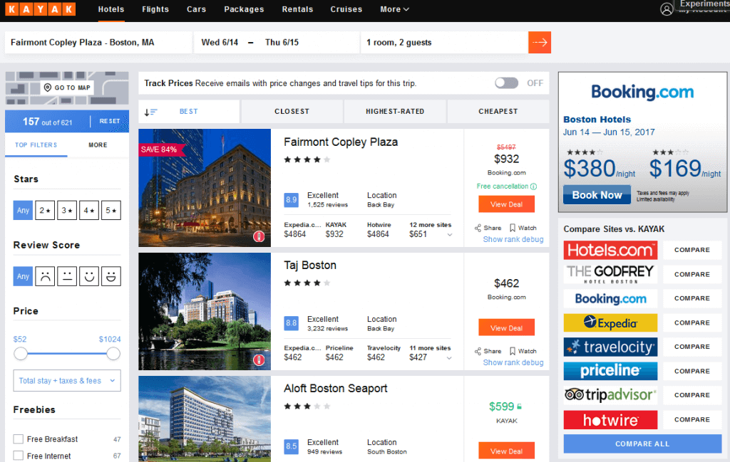
What’s New?
- 4 total ads per hotel (vs 7 in the regular Kayak UI)
- More prominent hotel rating
- More streamlined filtering options above the hotel list (the original UI more prominently displays stay type (e.g. business, family, luxury)
What This Means for Advertisers:
The most significant factor here for advertisers is dropping the total advertisers present in the ad from 7 to 4. If your strategy revolves around staying just above the fold in positions 5-7, this UI could lead to a decrease in click-through rate and overall bookings if it is rolled out. On the flip side, this will likely also increase the click-through rate for position 1-4. If you focus on staying in these positions, it would be worth keeping an eye out for any changes in this interface because it could lead to spikes in clicks and cost.
TripAdvisor
TripAdvisor has rolled out a new UI that should be pleasing to the eye to many users. Here’s a side-by-side look at the old experience followed by the new one:
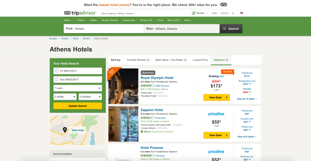
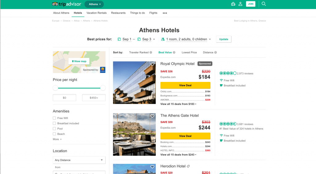
What’s new?
- Date selector displayed above results, pushing left rail filtering options higher on page
- More prominent hotel image in ad unit
- More prominent display of hotel reviews
- Inclusion of amenities
What This Means for Advertisers:
TripAdvisor’s focus on images and amenities puts more pressures on suppliers to ensure they have high-quality and complete hotel data. E-commerce and property managers should make sure their amenities and photos are up-to-date to fully maximize their TripAdivsor potential. Moving the date selector to the top of the page gives the filtering options more real estate at the top of the page, which optimizes the user experience and works towards keeping them on the site longer. We recommend keeping a close eye on performance from last week onward to see if the UI overhaul has moved the needle on your campaign.

