As the movie character Ferris Bueller once famously said: “Life moves pretty fast. If you don’t stop and look around once in a while, you could miss it“. Now I am pretty sure Ferris was not refering to the digital landscape and how marketers need to stay abreast of its fast evolution, but it is nevertheless our reality in the travel sphere, in particular for hoteliers trying to reach their target audiences online.
Have you searched online for a hotel recently?
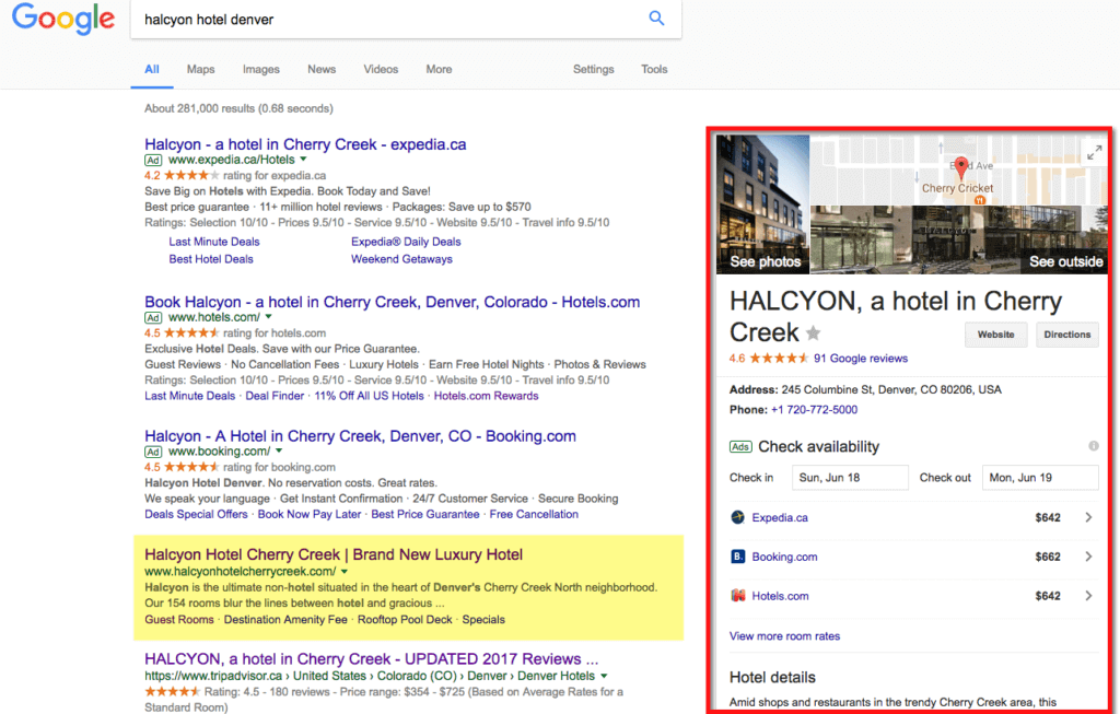
Let’s take a real example. Let’s say you were headed to Denver on business and had heard of this boutique hotel in Cheery Creek, the Halcyon. When searching for hotels by direct name, this is what we get:

While you and I may have gotten used to this way of showing results in the past year or so, consumers are faced with a new reality, including:
- Hotel feature box on the right, which highlights rates from OTA, reviews and contact details to the hotel (website, directions, etc.)
- Ads are more prominent, from top to bottom, with up to 4 ads. It used to be maximum three (like in this example), and there are no longer any ads in the right column. In fact, there is no such thing as a right column anymore, except for the feature box like in this example.
- Notice how organic results show up lower, in this case after the ads, just above TripAdvisor listing. Kudos to the folks at Halcyon for reaching this position, yet one assumes this to be somewhat “normal” since the search was with these terms. Imagine if it had just been “hotels in Denver”… getting to that first position is tough business!
Well, that’s not so bad, right? Hmm, did you know that back in 2013, when Google Ads were more clearly distinguished (on a slightly yellow background), 40% of UK consumers were unaware that Google AdWords were adverts! Imagine now, as Google removed the yellowish background and replaced it by a subtle “Ad” mention to the left of the copy… (see example above)
How Search Has Evolved
Back in 2005, you may recall Google came up with its “Golden Triangle” theory, or “F-Model” stating that online consumers searched from top left to bottom left, similar to a F-shape, with eyes then zooming from top left to top right, specially whenever there were images on the screen.


