A web layout is a skeletal framework that defines how the information will be structured and organized on the web pages.
NB: This is an article from Sabre Hospitality
It’s foundational to the user experience on any website, more so on e-commerce ones. When done right, layouts help expedite the shopping flow and have a direct impact on conversions as it impacts how quickly and clearly shoppers can find information. They also help differentiate the look and experience of the website. Keeping these impacts in mind, hotel booking engines must offer several layout options as hoteliers seek to boost direct bookings on their websites.
Why do layouts matter to a hotel booking engine?
Hoteliers invested in the need for direct booking strategies to stand out from the crowd. The booking engine layout plays an important role for the following reasons:
- Every hotel is unique. And, layouts serve to highlight the hotel’s unique strengths and appeal to its target market.
- Layouts help align the design to the guests’ shopping processes. It is important to know who is shopping and speak to what they are looking for.
- Layouts help to focus on the hotel’s Unique Selling Proposition (USP):
Consider boutique hotels vs spa hotels vs airport hotels main objectives:- Boutique hotels: Need to highlight the uniqueness of the property
- Airport hotels: Draw attention to their highly competitive / best prices
- Spa hotels: Promote packages that combine luxury experiences with room stays, as desired by their target guests
The design for these three hotels must be different to better serve their respective target segments. Layouts make it easy to achieve this goal.
Here are a few different layout options that have been tested by our UX experts:
A. View by Room:
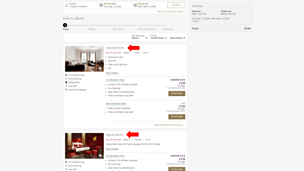
This layout highlights the room being offered first followed by the list of rates. It is proven to be the most popular view. It’s ideal for properties with only a few room types but many rates. This layout aligns with the shopping behavior of economy shoppers who prefer to sort by price.
For this layout, it is important to upload high-quality room photos and update descriptions. It is also important to turn on icons for room amenities, so the economy shoppers can quickly confirm the quick details that matter to them and proceed to checkout.
B: View by Rate:
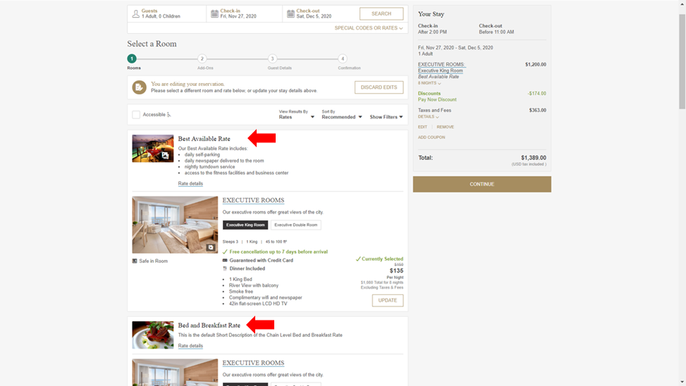
This layout highlights the rate offered first then the list of rooms offering that rate. It works well for hotels that offer a lot of package rates to show what is included in each rate. It’s important to upload rate images and descriptions in such a layout.
C. View by Category
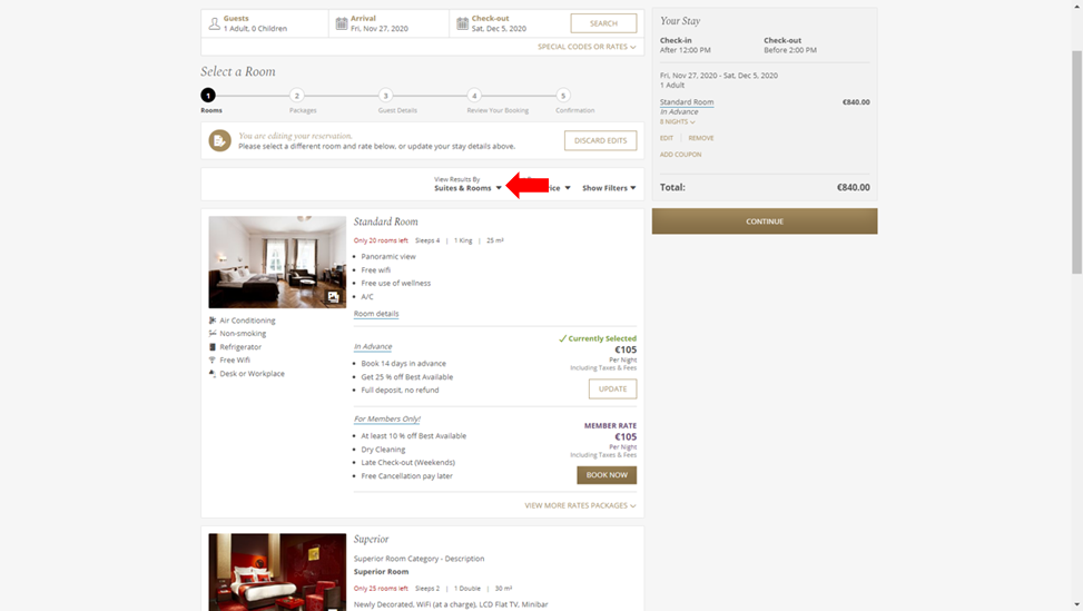
This layout works well if there are distinct categories (i.e. standard rooms, suites, penthouse, etc.) with rate differential. With this layout, hoteliers can showcase extra imagery around the rooms offered.
D. View by Category with Selectable Room Types
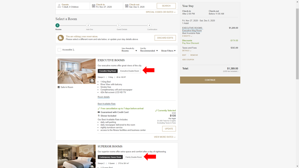
This layout works well for hotels that have room types that are separated by a single attribute (i.e. bed type or view). The category is shown as the main card item and the selectable list is the room types. In this layout, it’s important to update the room category descriptions to help shoppers understand the room types quickly and clearly.
Regardless of layout design, each of these layouts allows you to add relevant product content that aligns with the typical shopping criteria of your target segments. This includes:
- Amenity icons
- Policy icons
- Bed type/size/occupancy
- Room description options
- Rate description – with HTML options
- Images & video
Recommendations for layout options:
Simply having flexible layout options is not enough. You need to leverage them correctly to maximize their impact. Here are the top five recommendations and best practices to maximize layouts for a hotel booking engine:
- Provide a relevant layout based on your audience segmentation
You need to pick a layout keeping your target segment in mind. Frank Chimero, a renowned designer, aptly said: “People ignore design that ignores people”. The layout influences the engagement of visitors shopping on your website. So, it needs to make your products relevant to what they seek from your brand: uniqueness, best rate, luxury packages, or something else. - Choose your default layout carefully
What you set as the default layout view in your booking engine matters. Very few users toggle the layout views. However, they often toggle between List and Grid display of products. - Add plenty of high-quality photos
Our research shows that visitors look at photos first, then description. This is why it is important to showcase all products in high-quality photos that look great in a full-width desktop view. This applies to dynamic packages as well, if you offer them. The more expensive and sophisticated your hotel, the more your visitors expect to see a larger section of high-quality photos. For this reason, we recommend that you:- Consider at LEAST 3 images per room type
- Vary the images for similar room types to highlight what each room type includes
- Include room videos for specialty rooms (e.g. luxury suites, apartment suites, etc.)
- Remember: Content is king
To increase engagement and subsequent conversions, you must deliver ease and transparency to expedite the shopping process. Here are some content guidelines that our web design experts have curated after having implemented thousands of hotel booking engines:- Keep it simple and easy
- Tell shoppers in plain terms what their money is buying
- Try 2-4 bullets rather than a paragraph of text
- Use quality photos, short descriptions and descriptive names for rooms as well as dynamic packages
- Include bed type and view in the name of your room or use the modified category view to highlight multiple room types.
- Leverage room amenities icons as shoppers from different regions assume different default amenities. Use icons for rate policies as well – CC guarantee or free cancellation, meal plans—so that shoppers have quick access to information
- Maintain transparency of pricing: daily price AND total price
- Eliminate the math and give them the confidence to move forward
- Include taxes and fees in your pricing right from the first step.
- Don’t risk alienating visitors for rate parity with OTAs
- Our user testing has shown that guests consistently prefer knowing the total cost as early as possible
- Deploy Urgency Messages smartly
- Consider pushing urgency messages in three different areas
- At the chain level when the user is choosing a hotel
- At the hotel level when the user is choosing a room
- At the product level when the user is viewing a specific room
- Share real-time stats on the screen about how many are looking at the same hotel/product to persuade bookers to keep looking.
- Define a threshold for when guests should see these messages, especially at the room level to create the urgency to buy now
- Consider pushing urgency messages in three different areas
- Leverage custom content areas built into the layouts
- Custom content areas near the header and the footer provide additional ways to promote the brand, special offers, and loyalty benefits.
- Using the footer from the brand site offers visual continuity and keeps visitors within the same experience.
- Keep it simple and easy
- Boost relevancy with sort and filter options
Remember the primary goal with layouts and designs in a booking engine are to make the experience relevant to the shoppers. The Sort and Filter options you offer your shoppers are very important to boost relevance.- Always utilize filters with options that make it easy to find relevant results
- Consider including “accessible rooms” in the filter options
- If your products are targeting more experience-driven travelers, set the default sort order to “Recommended”. Visitors will see products sorted in the order you specify in your setup.
- If your products are targeting price-sensitive travelers, designate your default sort order as “Lowest Price”

