“This year is going to be the year of mobile” is a talking point you have likely heard every year for the past five years, and the soothsayers of mobile continue to be right.
NB: This is an article from Koddi
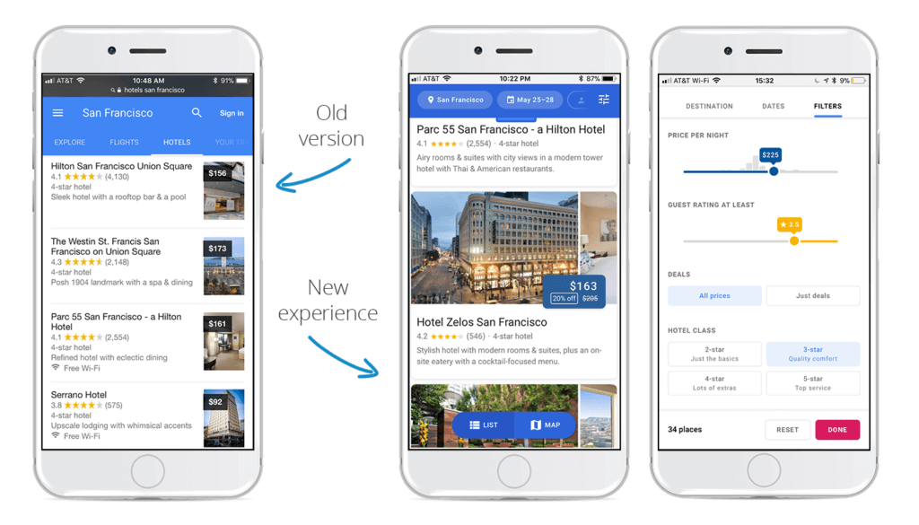
It’s no surprise to anyone that mobile users continue to grab market share in all digital marketing verticals, and in no vertical is this truer than metasearch. With the rising demand of mobile, metasearch publishers are constantly testing to maximize the mobile user experience. Recently, we found a new mobile experience on Google Hotel Ads. The tested mobile interface on Google had a refreshed hotel listing page, a cleaner call out for pricing, an updated color scheme, and a clear designation when a hotel has a competitive price.
Refreshed Hotel Listing Page
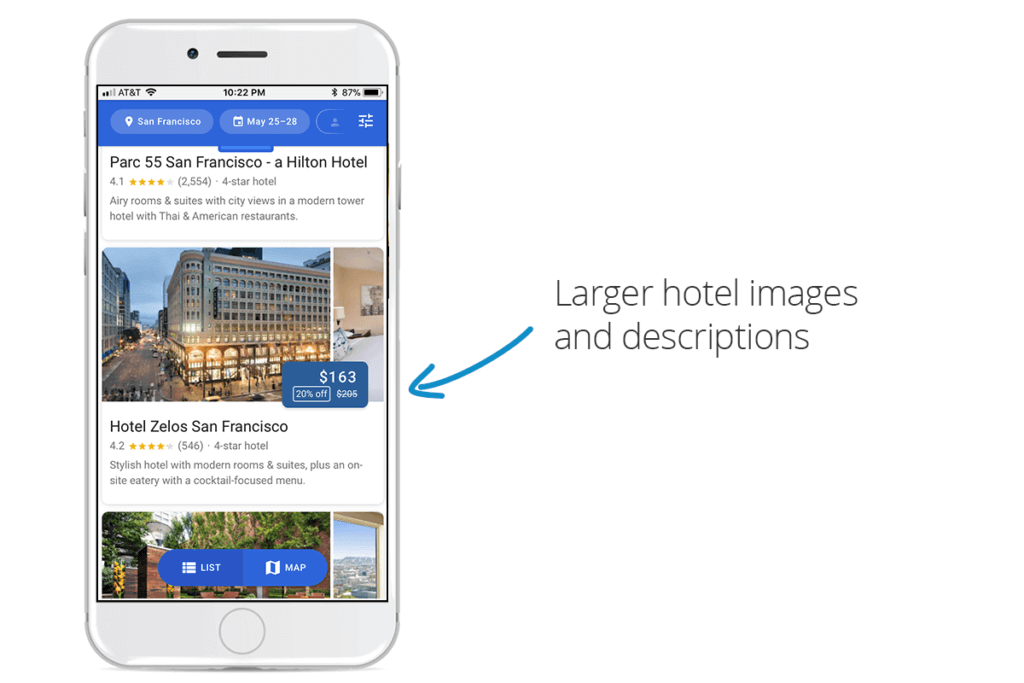
The new ad format reads significantly cleaner on mobile devices compared to the previous design. It has a larger focus on hotel images and a larger font for the hotel description. The consequence of this new UI, though, is that fewer hotels load on the screen. The potential implication of this is that hotels that appear towards the top of the search query are going to be more heavily favored by mobile users who don’t want to scroll through multiple pages.

Cleaner Call Out for Pricing
The new pricing call out is larger than before, giving more importance to the price of the hotel. This pricing scheme also displays strikethrough pricing on the main hotel listing screen (before getting to the meta auction), a user experience we at Koddi haven’t seen before. We know that metasearch users are very price sensitive, so anything that calls out lower prices or “deals” will likely see great success. The winners of this update will be any advertisers who are able to show rate advantages (member rates) to their users. This could cause problems, though, with rogue wholesalers who are undercutting the market.
Updated Search Toolbar and Map Toggle
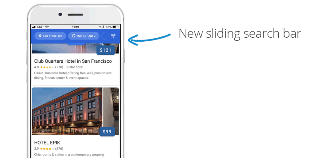
The search and filter toolbar is now accessible at any point on the hotel listing page. This is thanks to a new minimized version of the toolbar which remains in the top of the screen even when a user has scrolled deep into the search results. Tapping or swiping down on the tab will expand the full menu, allowing users to adjust the hotels that are being shown. This update not only looks slick, but it should improve how qualified your mobile site visitors are as many of their hotel-specific questions will be answered before clicking through. There’s also a new floating toggle switch at the bottom of the screen that lets users switch between list and map view. Both of these updates place a high priority on showing the user the exact hotel they are looking for at that moment.

Enhanced Buttons and Color Scheme
Other updates to the user interface include a new color scheme and round, modern buttons and search fields. The fresh coat of slate blue color on the price overlay stands out from the photos and the pricing is more legible than before. Anything a metasearch site can do to minimize user confusion will yield positive results, so this is likely to have a small incremental increase to mobile performance.

What Does This Mean for Your Campaign?
The world of metasearch is continually changing, and metasearch publishers are constantly testing every aspect of their site in order to maximize efficiency and improve the user experience. With the refreshed hotel listing page, cleaner call out for pricing, clear designation of competitive pricing, and updated color scheme on Google, we are likely to see shifts in the mobile market. Now more than ever, it is important to have a tight grasp on your metasearch campaign, and leveraging third-party partners to manage your metasearch campaign will ensure that you are on top of future shifts in the market.


