
Google has always done its part to stay innovative and make sure its products set the bar. So, it’s no surprise that Google is currently testing a new look to its hotel search engine.
NB: This is an article from Koddi
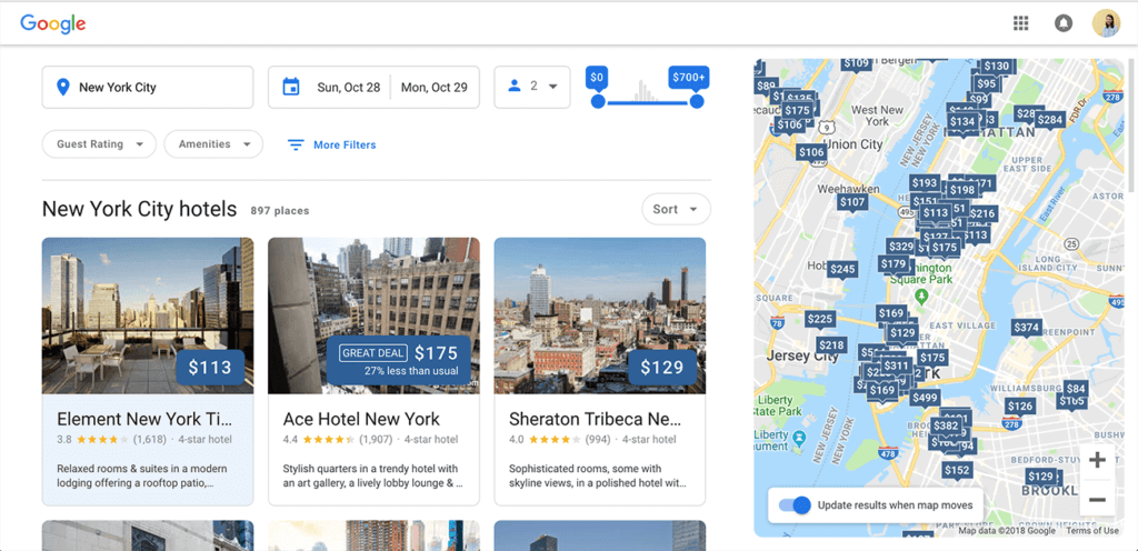
With the user in mind, this new desktop experience is as user-friendly as ever, with a cleaner and enhanced modern look as well as newly updated features.
What’s New on Desktop?
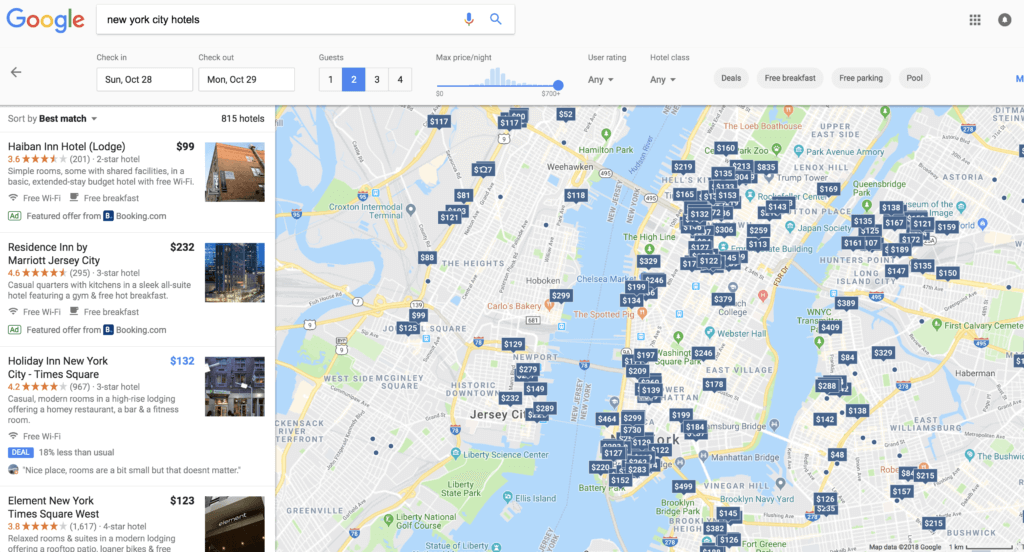
Many of the features between the current experience and this new test experience are consistent but presented in a more user-friendly manner. As seen below, the current layout can be overwhelming to users with multiple options to choose from in New York City. Whereas the image above shows the new test version of the desktop experience which highlights prices and available offers.
In addition, the new test experience allows the user to scroll through photos of hotels without leaving the browsing page. This can be done by clicking on the arrows displayed on each individual image. This feature saves the user time by remaining on the browsing page to view more photos. For each hotel, the high-level identifying information shown includes name, price, overall review, number of reviews and a star rating.
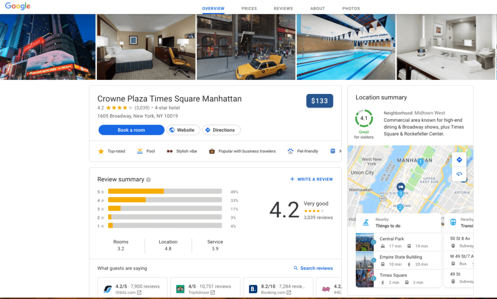
Once a user decides on a hotel, the landing page to make the reservation has also been updated with more useful information than before. On the top of the page, users can select what type of information they want to view. The new default page view is a hotel overview with hotel information such as hotel amenities, a guest review summary, location summary, competitive rates, room types, and even similar hotels (in case the one selected doesn’t suit the user’s preferences).
Other new tabs that can be viewed in more granularity include prices, reviews, about the hotel (which provides hotel specifics), and photos. This new test experience shows more granular information to help educate users about the hotel they’re looking at, minimizing any potential gaps in knowledge between their perceptions of the hotel and reality.
Look Familiar?
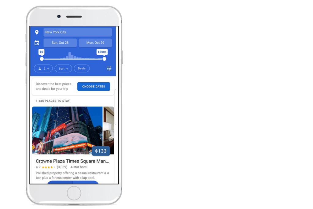
Below is the current mobile experience which looks very similar to the test experience on desktop, but shows 1-2 hotels at a time with the ability to swipe to view more photos as well as easily select parameters for a stay. This current version of the hotel search experience debuted on mobile earlier this year.
The end goal for these updates is to provide greater value to the user, satisfy their research needs, and help them book a stay that meets or exceeds their expectations. With the new user experience on desktop, additional information is available to help travelers make a decision more efficiently.

