Web design trends rarely stay still for long. In 2018, we’re seeing some creative new ideas and a few reimagined versions of retro designs. In the hyper-competitive hotel industry, great design is especially crucial. Guests compare options quickly and judge hotels within seconds based on the look and feel of their website.
Great design instantly tells your potential customers they’re in the right place. It lets them know your hotel offers the kind of experience they’re looking for. But more than that, it has the ability to distinguish you from the crowd, and hint at the possibility that your hotel offers something unique and special.
So what design trends are big in 2018? In the following post, we’ll look at five examples and show you how hotels are applying these trends to make their own websites rise above the competition.
1. Attention-grabbing imagery
In 2018, websites are getting bold and brave with color. Using vibrant colors and saturated gradients is a useful tactic to grab attention for sites that lack engaging imagery. Lack of images isn’t really an issue for most hotels, but we are seeing some hotels becoming bolder when it comes to picking their hero image.
Instead of completely filling the homepage with photos of their property, a number of hotels are integrating or leading with lifestyle imagery and brand-driven photos.
When visitors land on the website of the ocean-side Beach Terrace Inn in Carlsbad, they’re instantly met by the sight of crashing blue waves.
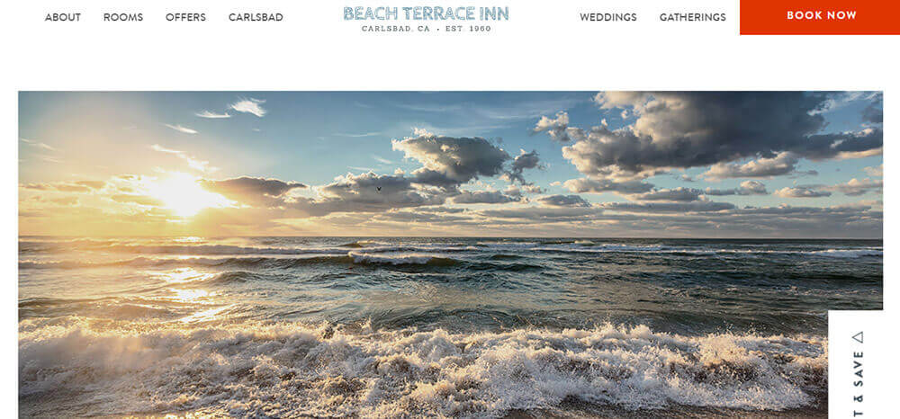
This full-width hero image does a great job of instantly communicating one of the hotel’s standout features—an idyllic setting right beside the Pacific Ocean. The impact is powerful, evoking an instant feeling of tranquility and escapism.
In contrast, the homepage of the Padre Hotel in Bakersfield uses imagery to conjure up a playful-meets-sophisticated lifestyle.
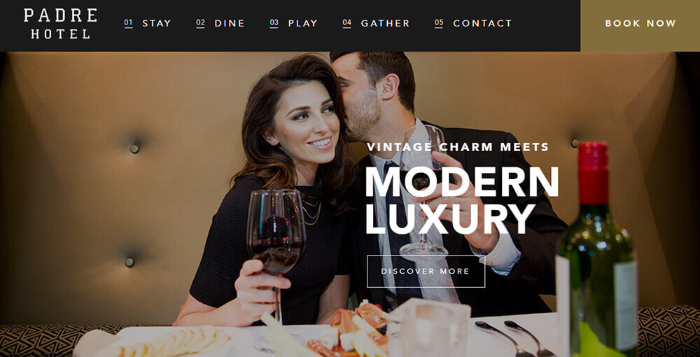
Another photo features a swish hotel suite with a rose petal-scattered bathtub and bubbling bottle of Rose. These vibrant, lifestyle-focused images are clearly aimed at couples and intended to sell the experience of a romantic and stylish city break.
2. Embracing bold fonts (and bringing back serif)
Thanks to new web CSS protocols, it’s now possible to use a wide variety of fonts to really show off your hotel’s personality.

