In the hospitality industry, it is essential to have a website. But, just having a website isn’t going to be enough to get visitors to book at your property over your competitors. If you want to play to win, you must have a website that’s built to convert.
NB: This is an article from TravelNet Solutions
There are more websites and property listings on the internet today than ever before, and more listings are being published every day. As a property manager, it’s your job to bring potential guests to your website and to convince them to convert before they leave, lose interest, book through another channel—or worse, book a stay at another resort.
So how do you do it? Here are 6 key tips for turning passive website visitors into confirmed bookings for your resort:
Tip #1: Make Information Easy to Find
The first step in driving people to convert after landing on your website is to make essential information easy to find. Consumers don’t want to waste time trying to find the information they need in order to make a decision about your resort. You have to make it incredibly accessible for them, otherwise, you risk losing them to a competing resort or mainstream booking channel.
To make it easy for website visitors, feature the following information prominently on your homepage:
Phone Number:
Despite the necessity and growing use of resort websites, many travelers still prefer talking to an actual human being when booking a reservation at a resort. If your visitors can’t easily find your phone number, but they still care enough to try to find it, they’ll probably leave and go searching for it elsewhere—like on your Facebook page or on your Google Business listing. The problem is, the internet is a distracting place. The chances that they’ll ‘get lost’ along the way is high. To prevent this from happening, place your phone number in easy-to-find locations on your website, like in the navigation menu or the footer.
Book Now/Availability CTAs:
Some travelers don’t need all the extra information you have to offer about your resort. Some are ready to book right away and they simply want to be able to check availability in a matter of seconds after landing on your website. To accommodate these types of guests, feature your booking or reservations CTAs in the top right corner of your homepage, or right below your feature photo (make sure it still loads above the fold). Use a contrasting color like yellow to make these buttons stand out from the rest of your page content.
Room/Lodge Photos:
Most travelers want to have a pretty good idea of what a room looks like before they enter their payment information to reserve it. To accommodate visitors who are not yet familiar with your resort and rooms, feature photos or links to photo galleries of your rooms, right on your homepage. Don’t hide your room photos in a general photo gallery of your resort. Make it easy for visitors to find the photos and decide within a few minutes that your accommodations meet their expectations.
Cleaning Policies:
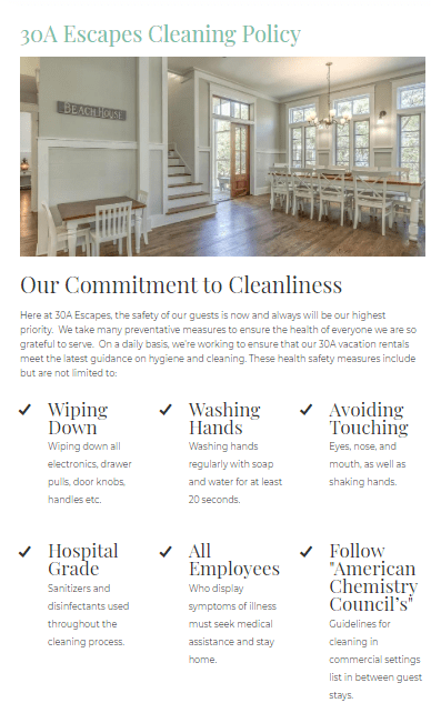
Especially In the age of COVID most travelers will want to know what your cleaning policy is. For the ease of mind of your guests make sure that your cleaning policies are predominately displayed on your website. You should have a page dedicated to your cleaning policies as well as use blog posts, pop-ups, and header bars to make your policies clear to guests. This article provides some best practices and examples of how to make your policies clear to potential guests.
Tip #2: Make Booking Simple & Clear
To encourage website visitors to book their reservations using your website, you need to make it simple and clear for them. That means keeping the following recommendations in mind when building or updating your website:
Make Your Website Responsive
More people than ever are searching for resorts, checking availability, and making reservations on their smartphones. As a property manager, it’s your job to make sure that your website displays quickly, correctly, and functionally on all devices—for Android and iOS.
Make Checking Availability Simple
As mentioned in the first tip, you need to make sure that your website visitors can easily find and utilize the availability-check feature built into your property management and CRM tool. Again, it’s also important that your availability tools work correctly on mobile devices.
Make Visitors Feel Secure
To help visitors complete the reservation process, do what you can to make them feel like the information they are submitting is safe and secure. You can do this in a few ways. First, make sure that the platform you are using to accept payment uses an SSL certificate. SSL certificates ensure that any sensitive information passed by the user is kept protected after they submit it. Second, add trust badges to your booking pages to remind guests that their information is kept safe and secure at all times. Finally, reassure guests by including trust statements throughout the pages they will ultimately see during the booking process. Use phrases like, “your information is secure,” “we never share data with third-parties,” and “risk-free.”
Tip# 3: Make Your Resort Seem Irresistible
Buttons and links that send people to your actual reservation pages are important, but so are the words and images you use to sell people on your resort. If your website visitors can’t get a good grasp of what it would be like to stay at your resort—if they can’t understand what they are missing—the likelihood that they will click on any booking buttons or links remains relatively low.
To make your resort seem irresistible, feature high-quality photos and videos on your resort homepage and throughout your website. Help your guests virtually navigate around and through your resort and pair this rich media with compelling headlines and supporting text.
Need photo/video ideas for your property website? Here’s a quick checklist you can go through:
- Room photos
- Restaurant photos
- Resort photos (ground-view)
- Resort photos (aerial-view)
- Resort activity photos
- Staff photos
- Guest photos
- Tour videos
- Local attractions videos
- Guest review videos
- Hotel storytelling videos
You can also use testimonials and reviews from happy guests to convince your website visitors to book reservations at your resort.
Tip# 4: Build a Website for Your Audience
When building or updating a website for your property, it’s important to remember that you’re not building it to convince yourself to book a reservation—you’re building it to convince your audience. In other words, you might have subjective opinions about what a website should look like, but if your ideas don’t ultimately cater to your audience, don’t let them get in the way. Your top goal should be to connect with your target guest and convince them within a few moments after landing on your website that yours is a resort worth staying at.
In order to build a website for your target audience, you need to know who your target audience is. You need to have a good understanding of what they like, how they act, what they look for when they stay somewhere else, what they expect to see, etc.
For example, are you a bigger resort catering to an upscale audience that values extra luxuries and amenities not usually found or offered at most hotels and resorts? Are you a charming bed and breakfast that can offer visitors a relaxing and cozy environment? What about an off-the-grid lodge that offers guests the serenity and peacefulness of the outdoors? Your website visitors should be able to understand who you are within seconds of landing on your website.
Tip# 5: Make Your Website Seem Familiar
Another way to help push potential guests toward conversion is by making your website feel like a familiar place to them. Your goal should be to make website visitors feel comfortable when they land on your website—they should feel like they already know what your resort looks like, what kind of person stays there, and what it is that makes your resort unique. You can achieve this in a few ways:
- Use consistent resort photography. One of the easiest things you can do to make visitors feel like they already know your resort is to use consistent photography across all your marketing channels. If you feature one or a few primary photos on your homepage, make sure to also use the same photos in your email campaigns, on your social media pages, in your advertisements, and on any other listing websites, you use. When you use different photography in each channel, you risk leaving people wondering whether they landed on the right website.
- Launch remarketing campaigns. Another way to familiarize potential guests with your resort is to launch retargeting and remarketing campaigns that ‘follow’ them around as they visit other websites and social media communities on the internet. To learn more about how other resorts and hotels in the travel industry are using retargeting to convert website visitors, explore this blog post.
- Use photos and reviews from real people. A final way to make visitors feel more comfortable when they land on your resort website is to use photos and stories from real people. Because your potential guests aren’t walking through your doors to book a stay with you, it’s important that you make an effort to humanize your website. Don’t just show photos of empty hallways and restaurants on your website—show them alive and full of happy people! Make it easy for website visitors to relate to and want to be like the people in your photos and videos.
Tip# 6: Make Follow-Up a Priority
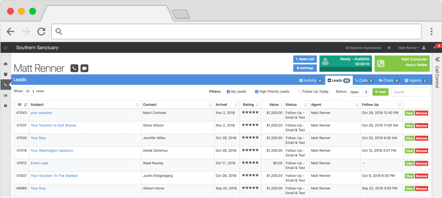
The final tip for turning website visitors into confirmed bookings is simple: follow-up with people who don’t convert right away. The two main ways you can do this is through email marketing and over the phone. To keep track of leads who call your resort to talk to an agent or those who provide you with their email address but aren’t quite ready to book yet, use TRACK Pulse.
TRACK makes it easy to circle back with potential guests who don’t reach you right away and also allows you to build and send targeted follow-up email campaigns aimed at driving leads toward making a reservation.
The key here is to remember that not everyone who lands on your website will convert right away. Using technology to capture and nurture leads in this way will allow you to identify and go after opportunities that you might have otherwise lost out on.


