
Landing page optimization and conversion rate optimization (CRO) is a study and an art all in its own category. In case you don’t have the time to dive headfirst into the world of optimizing calls to action on your hotel’s website.
NB: This is an article from gcommerce
Earlier in the spring, as the coronavirus pandemic had most hotels shut down, we saw some consistent requests for information on weddings hosted at hotels. While most of our clients were seeing decreased demand for room nights, we thought it was a great chance to create an A/B test on the call to action of a wedding page.
Subscribe to our weekly newsletter and stay up to date
Many practitioners of CRO would tell you the position of the call to action within the page is incredibly important. In the case of our wedding page, the call to action was a button with the text “Start Planning”. We wanted to see if we could increase the conversion rate of people requesting information for weddings if we moved the call to action to the top of the page. Using Google Optimize, we created a true A/B test with half of our traffic being sent to the original page and the other half being sent to the test page that had the call to action at the top of the page.
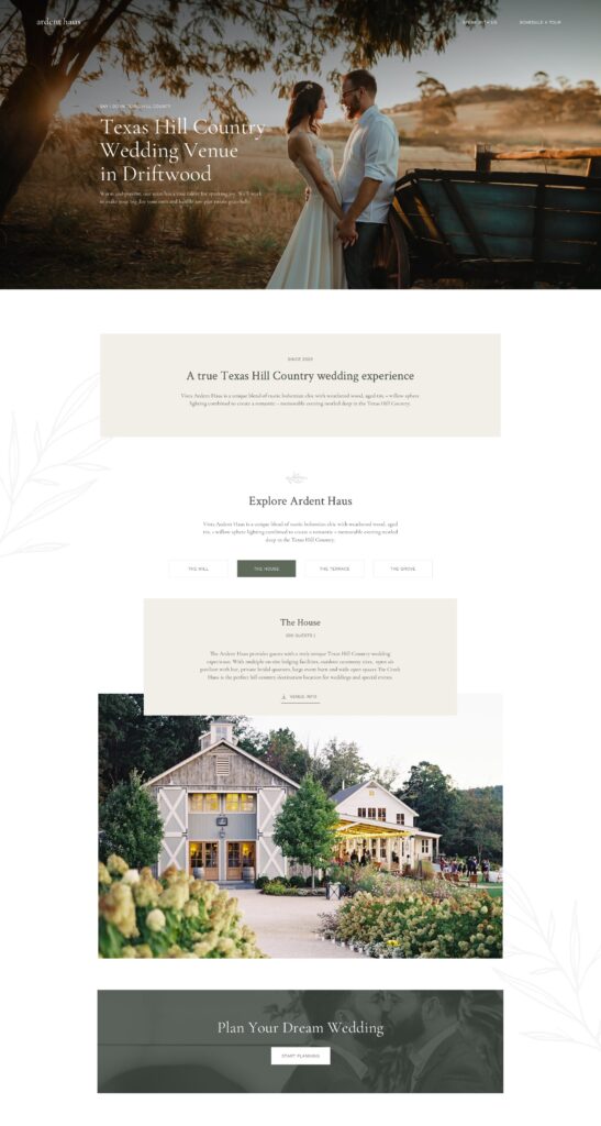
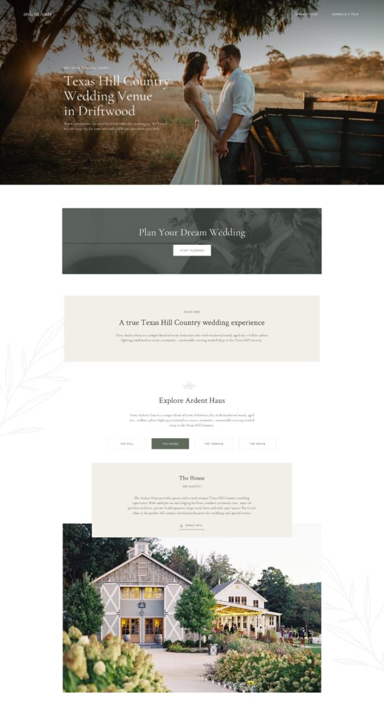
After 90 days, we evaluated our results and found that keeping the call to action at the bottom of the page kept conversion rates higher. We think this may have something to do with the nature of booking weddings at a hotel; users generally want a lot of information and want to see photos and details about the venue.

Having this information in our hands was important as we moved into the summer and the hotel was able to start accepting guests again. We wondered if we could improve the conversion rates of a package offer through the hotel if we moved the call to action lower on the page. Similar to the wedding page, maybe we could increase conversions if the call to action were below the details about the offer? We chose to run our next test on a rooftop package page that provided a food & beverage credit to the rooftop bar. We felt this was a package that could appeal to visitors during the coronavirus pandemic and wanted to have as much impact on increasing conversions as possible. Another A/B test was created on a rooftop package page with 50% of traffic going to each version:
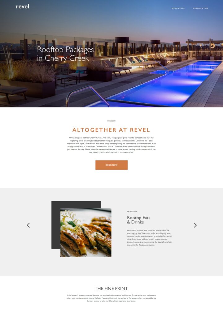
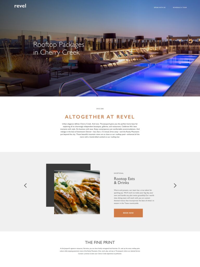
Once again, our hypothesis proved to be wrong and our variant of moving the call to action to the bottom of the hotel package page performed worse than the original:

In an attempt to totally redeem ourselves, we set up a final A/B test to see if the call to action at the top of the rooftop package page would perform better since people booking packages seem to be interacting in a different way than those requesting information about weddings:
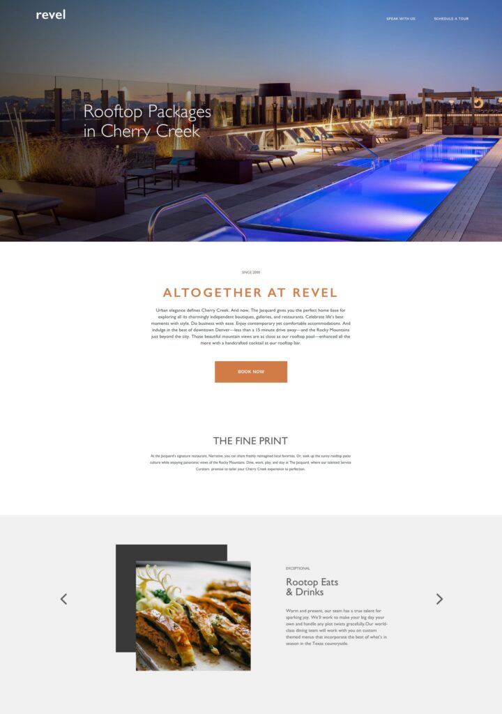
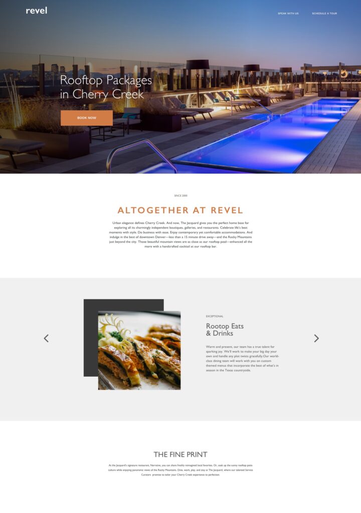
Finally, we seem to be getting some positive results on our variant and we have currently recorded about twice the conversion rate by moving the call to action higher up on the page.

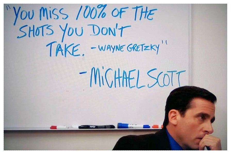
What is important to note here is that while our first two A/B tests were not successful, they established a base of understanding and allowed for additional tests to be run. The only failure in running A/B tests is not running them at all. Even if the test doesn’t go as planned, there’s always a lesson to be learned. Fans of The Office may appreciate Michael Scott’s take on the subject:
Knowing that conversion rates are different based on the location of the call to action AND the nature of the services you are trying to communicate to your guests is vitally important to improving user interactions on your website. There is no better time than now to begin running A/B tests on your hotel website.


