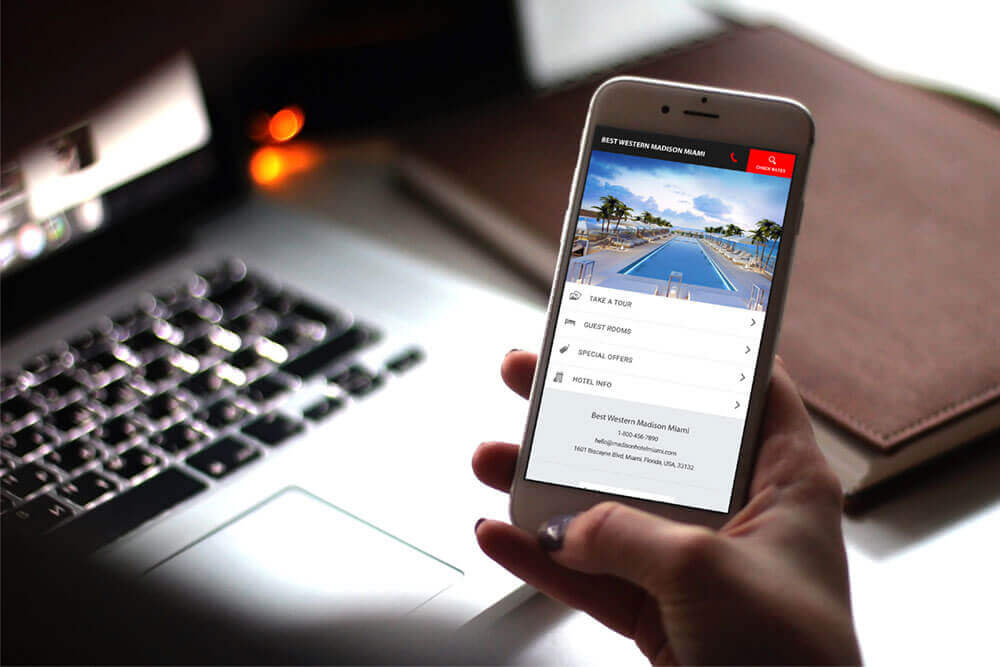
In 2017, more people are searching the web on their phones than on a desktop computer, and are five times more likely to leave a website if it isn’t mobile-friendly.
It’s imperative for hoteliers to fully understand the benefits of optimising their online marketing efforts for mobile, or run a very serious risk of alienating potential guests and losing business.
Luckily, this process is not rocket science. We’ve put together a handy high-level ‘cheat sheet’ you can use to help ensure your transition into the world of mobile is as smooth as possible.
Profiles of a mobile user
First, let’s consider what a mobile user wants out of their browsing experience. A team of researchers at Google and AnswerLab conducted a series of in-person studies with different focus groups, asking them to complete tasks like make a purchase, book a hotel room and conduct research on their own cell phones.
Their most important findings showed that:
Mobile users are very goal-orientated (make sure that call-to-action button is always visible).
They expect to get what they need from a site easily, immediately and on their own terms.
Businesses will ensure success by designing a phone friendly site with these needs in mind, but without sacrificing richness of content.
Smartphone bookings are rising around the world, and hotels remain the subsector in which smartphone bookings are most common, generating one in five online bookings in Q2 2016 – Travel Flash Report, October 2016 edition, Criteo.
Common frustrations for mobile users
According to technology solutions company Leonardo, some of the most common frustrations for mobile users on hotel or booking websites include:
- Tiny, hard-to-read text forcing you to pinch and zoom.
- Large visuals that load slowly.
- Pages that stretch beyond the width of your screen, requiring you to scroll around.
- Small links that are difficult to click with your finger.
- A frustrating booking process.
- No clear links or functionality to quickly connect with the hotel.
- Pages originally optimised for desktop browsers that take a long time to load on mobile
- Overall, an unpleasant user experience.
A mobile site should be fast, responsive and direct users to their end goal with ease. With that in mind, you can begin to think about structuring your website’s content
A good place to start is considering how to structure your content framework for smartphones. Essentially, there are two main approaches:


