NB: This is an interview with Lucas Chevillard of Airbnb via Medium.com
We strive to find the people in our industry who have something worth sharing. We’re curious about email because we believe it’s the most used product on earth, and it’s the channel that more businesses grow by than any other. Yet, it can be annoying to use, get, and send. That’s why we’re exposing the best of the best and curating a great collection on ReallyGoodEmails.com — when we’re not interviewing the giants.
Thanks for joining us, Lucas. What’s your background and how did you get involved with Airbnb?
After studying communication and advertising, I specialized in acquisition and retention with a focus on mobile marketing. I had great experiences with Airbnb and was looking for a place in Berlin when I checked the job page and saw the offer. I have been here since.
What kind of tests are you currently running? Any results that you can share?
We are running all sorts of tests as we are supporting both side of our platform: hosts and guests. On the host side, we have focused on a few cities to pilot a strategy that we plan to scale in 2016.

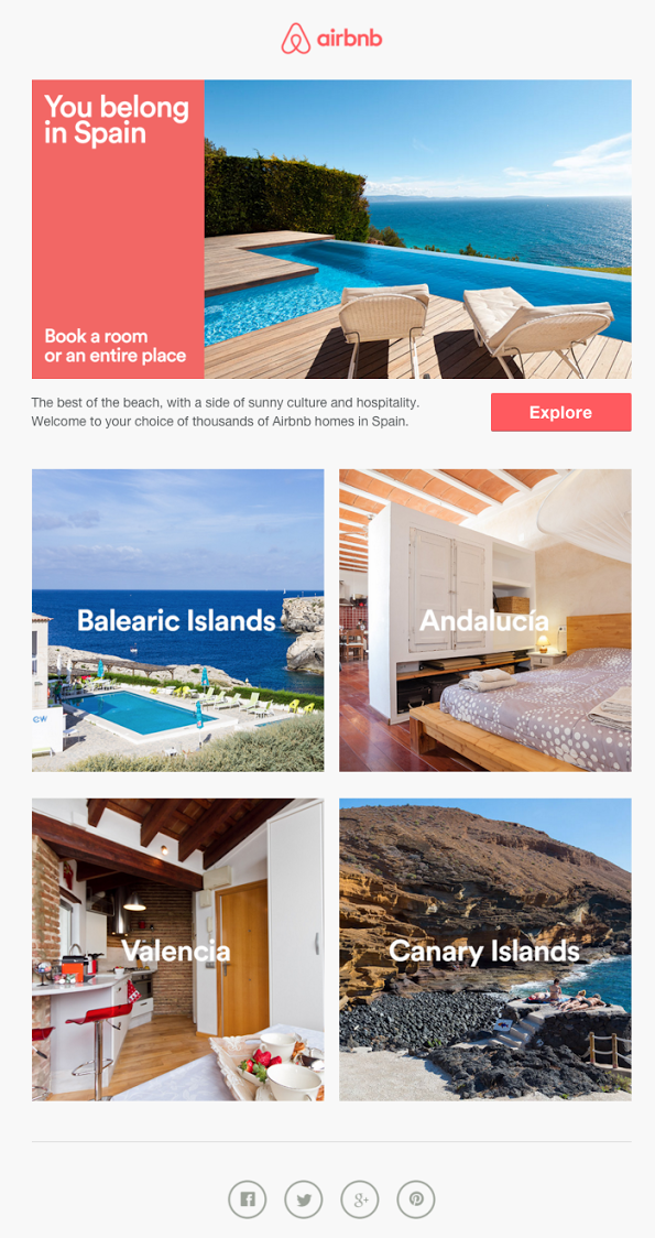
For example we A/B tested design elements for this email. For users who are not active hosts on Airbnb, we assumed that with an improved design our email would perform better, but we discovered that this was only true in some cases.
On the guest side, we are working a lot on explaining our product flow as new users have some difficulties with it. For example, we ran different tests explaining the importance of having a profile picture, the difference between the room types or what is Instant book. We just launched a new onboarding series that should help on all these topics.
It sounds like you’ve been doing Airbnb emails for awhile now. What’s one thing you thought you knew at the beginning that you now understand differently?
Public holiday emails are something we thought that could be impactful but we keep seeing poor results for our campaigns around them. So we tend to move away from them.
What is the most important email KPI to your organization? How do you optimize your emails for that without hurting the aesthetic?
On a campaign level, it’s successful when our hypothesis shows an incremental result over the control group. Overall, we always look at 2 KPIs: quality score 1 — (Unsubscribes / Responders) to measure engagement quality with the email and search with dates as it shows a clear intention for a user who’s interested to travel. The quality score really helps create better emails because it will show you the percentage of users happy with it. We always aim at 80% or more.
I also personally like to have a look at social media to get qualitative feedback. For example, last year we sent a campaign with the subject line You Belong in Spain and saw great reactions from people sharing it on Twitter. The creative was simple but the copy worked really well.

What does your build-out process look like? Can you explain your logic from start to finish, who is involved, and how you keep track of everything?
Depending on the projects, we generally come up with hypotheses on how to solve an issue or help another team. We take it to our insight and local teams for feedback. Then start creating it with our content and development team before deploying and checking the results few weeks after.
We mostly use Asana and Google docs to track progress.
How do you go about personalizing Airbnb’s emails?
That’s going to be our big focus for 2016. We’ll spend some time reviewing all our emails to see how we can optimize them with personalization. We want to bring more relevant data in the content of all emails.
For instance, we saw great results from a behavioral email series we tested where we asked our users to pick a continent, a topic for their trip and the best home according to their first 2 picks.

The first email’s subject line was: Choose your adventure. Based on what you clicked on, let’s say Europe for example, the second email you would receive would be about Europe and the subject line would be: Your adventure in Europe awaits

From there, we would tailor the next email based on your defined interests. Again, for example, if you clicked on “Romance” from the prior email, you would receive a third email with the subject line: Ready to embark on your romantic adventure in Europe?

There are so many people competing in the hotel and travel space. How do you use email to compete against others?
We use email to show what the Airbnb experience looks like and we are really strategic about all our emails. That’s why we focus on the quality so much over quantity. To illustrate the experience, one of the best emails we sent in terms of engagement is when we showed Instagram photos posted by the community.
Read rest of the article at: Medium


