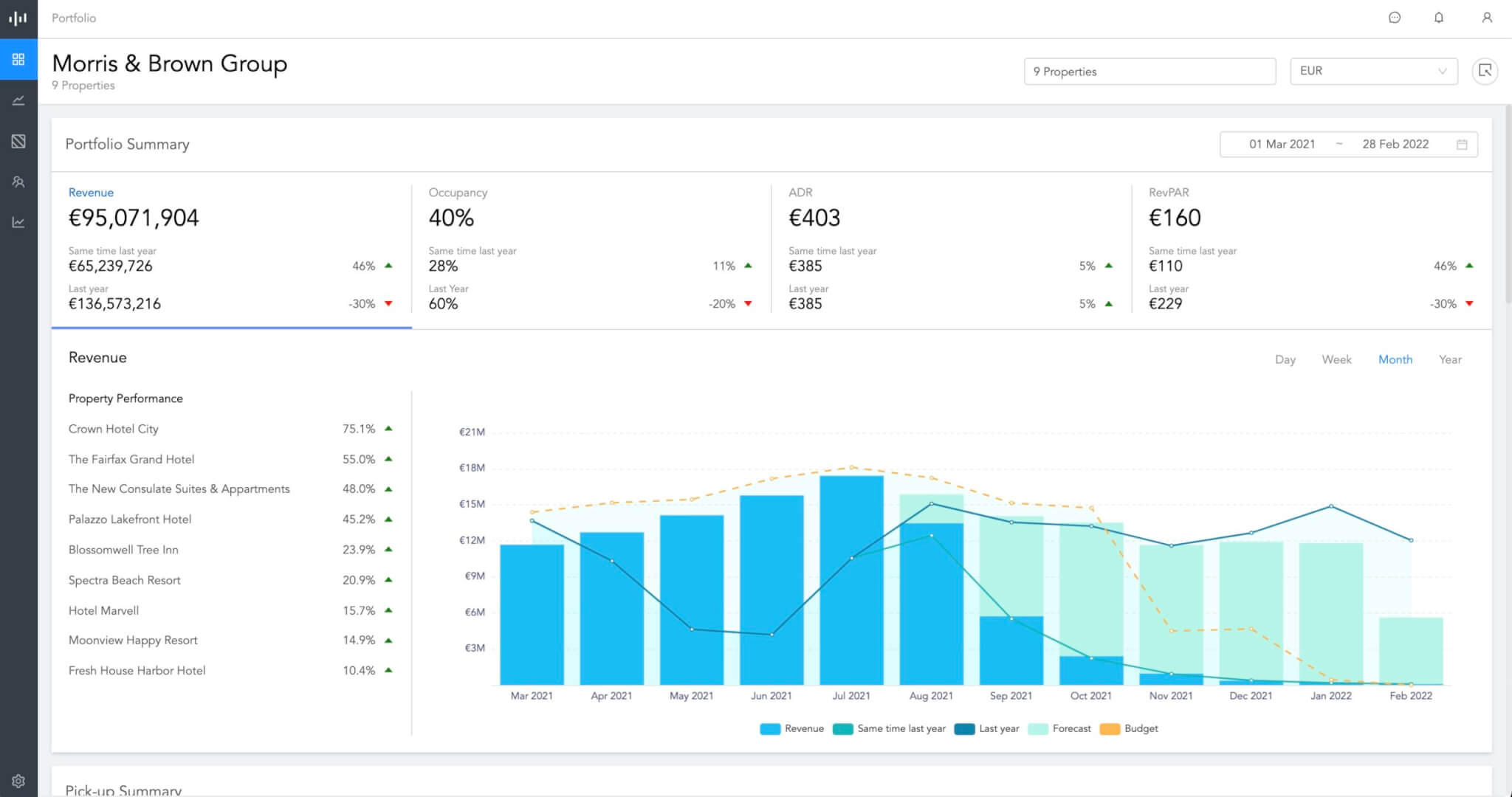
So we’ve just launched a brand new dashboard along with a full redesign of our navigation… and we hope you love the changes as much as we do!
NB: This is an article from Pace Revenue, one of our Expert Partners
For some time Pace’s entry dashboard and navigation haven’t changed much. Originally, we were focused on how a single property was performing. But this is no longer enough and we need to show how a portfolio of properties is performing along with being able to highlight which individual properties may need specific attention. Our user base has grown and the vast majority are running automated pricing (80% of customers are now fully automated!), which means daily workflows have changed and we need to be able to answer more complex questions our customers may have.
Subscribe to our weekly newsletter and stay up to date
Where to focus my attention?
With our new portfolio level dashboard we want to help our customers understand how they are performing across their properties. It gives quick insights into which months are currently over or under-performing against the previous year and the budget. But it also highlights which individual properties are under-performing so that our Revenue Managers can zero in on what needs attention.
For example, we’ve added two things we think are particularly handy. For all those who have properties across different currencies, your Pace dash now provides currency conversion for all your favourite metrics. That means real-time currency conversion toggling for your revenue, forecast or budget! No need for any clunky configuring, manual tracking or updating every quarter.

Another one we think is really useful is the ability to aggregate data across different PMSs. Beforehand, it was almost impossible to see data aggregated across properties in an RMS unless they ran on the same PMS. But now our data normalisation ensures that data is always comparable across all properties – regardless of the PMS being used. This gives the ability to look at the whole portfolio in one place rather than having to manually aggregate the data in Excel spreadsheets.
A new layout
All of this functionality is embedded into our new layout, which aims to help users navigate content more efficiently. More importantly, it also allows us to easily introduce awesome new features in the future. By rethinking how users interact with content within Pace, we will now be able unlock a range of new functionalities easily accessible from the navigation. In fact, some of these we will be rolling out in the coming weeks and months including restriction recommendations, segmentation forecasts, group management and more.

We are incredibly excited to have such an amazing group of customers who are constantly helping us to iterate on product ideas and share feedback. We hope we can keep playing our part in helping transform revenue management for the better.


