$5.73bn in revenue. Nearly $400m in profit. And a market cap of over $15bn.
That’s Expedia in a nutshell.
One of the largest travel sites in the world, Expedia and its subsidiaries (which include Hotels.com, Trivago, HomeAway and Travelocity) help millions of travelers find flights and hotels every month.
Conversion rate optimization is a major concern for a business as large as Expedia’s.
When you’re dealing with tens of millions of transactions every year, even a 0.2% bump in conversion rates can translate into millions in extra revenue.
For obvious reasons, there’s a lot you can learn about CRO best practices and innovations by understanding how Expedia turns visitors into customers.
Paul Rouke, Founder & CEO at PRWD previously wrote about Booking.com being the most persuasive website in the world, and after using Expedia for the first time, I think it also deserves to be ranked among the best in the business.
In the first of two posts, I’ll do an in-depth teardown of Expedia.com and show you how it converts traffic coming in from two different channels – organic search and direct type-ins.
Part two, due to be published next week, will focus on traffic from PPC and social (organic and paid).
Expedia: Then vs Now
Expedia was founded in October 1996, which makes it one of the oldest travel sites online.
Here’s how the site looked like at launch:

The site did not even have a search box when it was launched, let alone a flight booking facility.
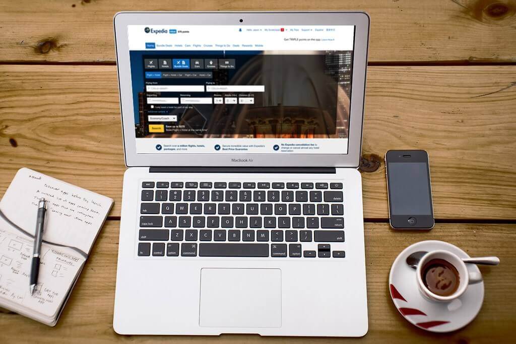
This is a far cry from the slick, conversion-optimized website that greets you today:

If you’ve hung out on any CRO focused websites, a few things about the Expedia.com site will jump out immediately:
1. Highly noticeable CTAs: Both the “Search” button and the top “Hello bar” are in a bright shade of yellow.
This grabs attention as soon as you land on the site, especially when contrasted against the blue/gray colors.
2. Non-intrusive navigation: The navigation menu doesn’t necessarily grab attention. Instead, the entire focus of the site is on the flight/hotel booking area.
3. Distinctive notifications: The notification icon in the top navigation menu has a distinctive red color and a clear “alarm” icon.
You can’t really land on the homepage without noticing it.
4. Above the fold: All the important information – booking a flight, checking out different deals , etc. – is above the fold.
In fact, you don’t even have to scroll down the page to book a ticket or a hotel room.
There are plenty of other tactics Expedia uses to grab and focus user attention, as you’ll see later.
Read rest of the article at eConsultancy