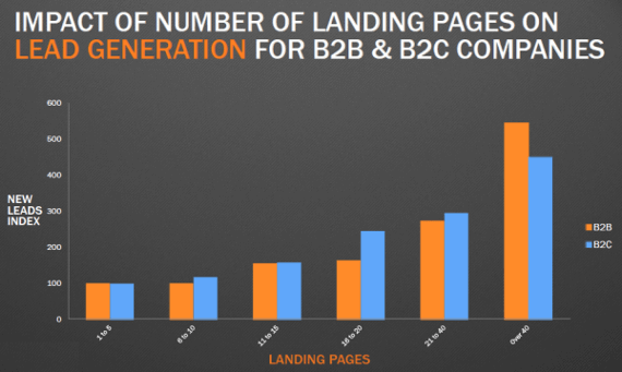
The booking button on your hotel website is the goal – it’s not the strategy. To persuade guests to book, you need a hotel marketing strategy to drive qualified traffic to your site and, once they’re there, convince them you’re the best! You need pages that are solely focused on driving direct bookings. These are known as landing pages, and they are highly effective.
For example, Dell increased their conversion rate by 300% with landing pages. Your hotel can win with landing pages by using them to promote your special offers, weddings or other specific events.
If you’re on the fence about investing in landing pages, we’re here to tell you why they’re so important. Here are the top 4 reasons landing pages are right for your hotel marketing strategy:
#1 Landing Pages Focus on One Thing:
There are a lot of distractions present on the average hotel website’s home page, even the best-designed ones.

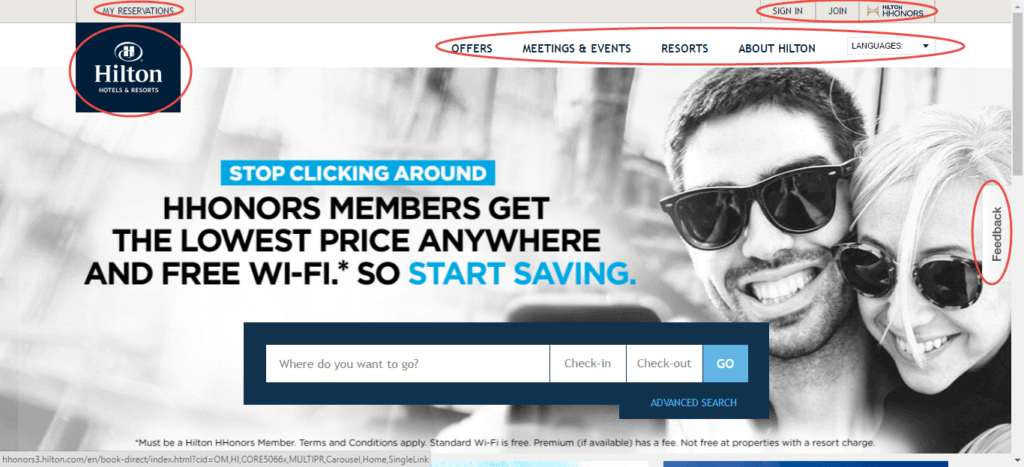
Even Hilton’s homepage has a booking form, the navigation menu with different types of rooms, offers, restaurants and other services like spa and gym. On the home page there are also distractions like email signup forms, links to the different parts of your website, and various special offers.
We’ve seen hotels with 3 or 4 different scrolling banners on their homepage, plus popups and other animations – that’s a distracting mess worthy of the late 90s.
Now, signup forms, links, and navigation menus aren’t bad. They each have a role to play, and they help guests through various stages – dreaming, researching, looking and figuring out what they want. Landing pages, however, are focused on a single goal, like getting signups to your loyalty programme or getting bookings for one special offer.
When it’s time to book, your homepage features become conversion killers. We usually assume that more options = more choices = high conversions. However, having too many options can actually causes chaos and unhappiness .
It makes it harder for potential hotel guests to make a decision.
Read rest of the article at NetAffinity


