
First impressions in hospitality are formed within seconds, often before guests are consciously aware. From a digital advertisement to the hotel lobby, people start evaluating their surroundings almost immediately. Color plays a major role in this process, serving as a powerful tool for shaping guest expectations and experiences.
NB: This is an article from gcommerce
Subscribe to our weekly newsletter and stay up to date
What is color psychology, and why it matters
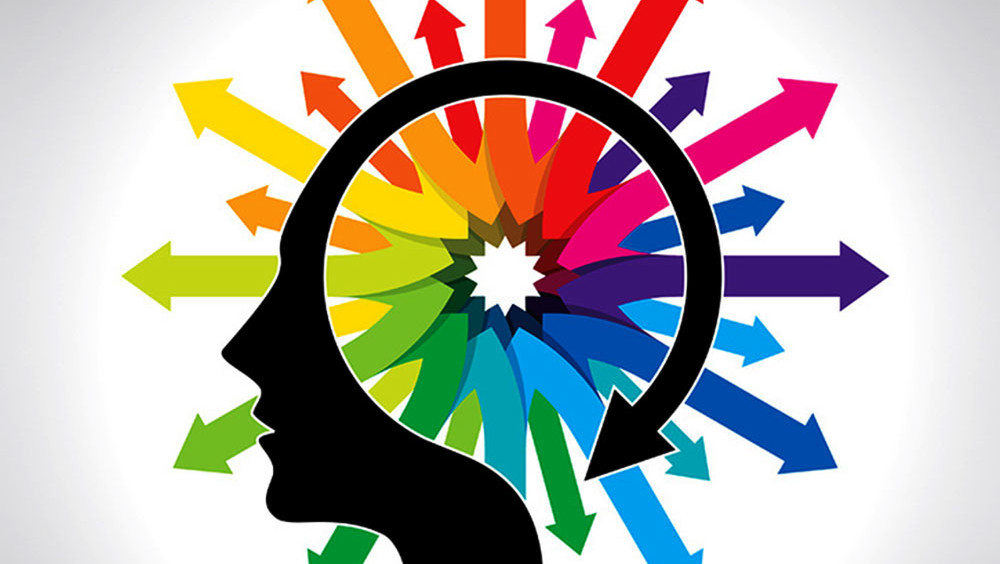
Color psychology studies how different colors influence our emotions, perceptions, and behaviors. In marketing, colors can guide attention, communicate brand values, and influence decisions. For hospitality brands, color choices go beyond decoration – every shade used in rooms, websites, or marketing materials shapes the guest experience. When chosen thoughtfully, colors can help guests feel comfortable, inspired, or excited, depending on the brand’s goals.
Emotional engagement is at the heart of hospitality marketing. Research shows that visual cues, especially color, strongly affect purchasing decisions. For example, marketing scholar Satyendra Singh found that color can be used to stimulate appetite, lift mood, calm guests, and even make wait times feel shorter. In practical terms, the colors guests encounter in a restaurant, spa, or hotel room shape how they feel and influence their next actions.
Using color psychology across digital marketing channels
Color isn’t just for physical spaces; it plays a vital role in digital marketing, too. Social media ads can stand out with high-saturation warm colors, while display banners benefit from high-contrast combinations that draw attention to key messages. Websites and email campaigns often use a single accent color for calls to action, guiding guests to book or engage without disrupting brand cohesion.
Many think color psychology requires a full rebrand. In reality, it works best by enhancing existing brand colors.
Hospitality marketers can boost results by introducing accent colors, using lighter or darker shades for contrast, and applying complementary colors in digital campaigns without altering physical spaces. For example, a brand with cool blues and grays can preserve its calm, trustworthy feel while adding a warm accent CTA color to increase engagement.