Your potential guest has visited your hotel website many times before. You know they’re searching for a five day trip for two in August.
NB: This is an article from Sojern
But they still haven’t converted, or even clicked through on your banner ads. Why? If you tested your creatives you might find out.
For years Sojern has run creative A/B testing, optimizing creatives and sharing best practices with hotel marketers so they can benefit from more direct bookings. Here are our top five findings, which can dramatically improve campaign performance:
1. Animate Ad Creative with HTML5
Animated banner ads are ads that have an element of movement. With that, they’re far more engaging than static ads—they’re eye-catching and travel inspiring.
Although animation can be complex, the animation is a breeze with HTML5. HTML5 ads are coded similarly to a website, so there’s no need for a plugin and the load times are much quicker. Years ago, Adobe Flash was the standard in creating animated banner ads. With a majority of iOS (Apple) devices and other platforms no longer supporting Flash, HTML5 became the new standard. HTML5 ads also give you the flexibility to render in different sizes across mobile devices, tablets, and desktops seamlessly. With faster load times and the flexibility to render ad sizes seamlessly across mobile devices, tablets, and desktops, even Google and Adobe have fully committed to the HTML5 format, disabling Flash ads in 2016 and soon in 2020 respectively.
But to be sure, our creative analyst team put them to the test, placing animated HTML5 ads against static (jpg) ads. And indeed, HTML5 ads saw an 8% lift in people converting and over a 13% higher CTR (click-through rate) than the static ads.
Pro Tip: Google is so committed to HTML5 ads that they even made a free HTML5 tool called Google Web Designer so users can create their own ads.

2. Test Hotel Specific Creatives
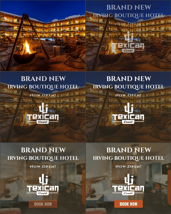
If you’re in the hotel industry, knowing which image of your property will perform best is important. Typical images for hotel banner ad creatives are usually that of the interior room, the exterior of the property, amenities (pool, bar, restaurant, etc.), and lifestyle (images that contain people).
Sojern recently tested which image performed best, and what we discovered went against our own hypothesis.
First, we tested interior room images versus exterior property images. The exterior images were the clear winner, with a 55% higher CTR than the room images. Next, we pitted the exterior images against amenities. While we found that amenity images resulted in 5% more clicks, it also gave us a 28% lower conversion rate. Finally, the exterior image moved forward and went up against lifestyle images. Again, we saw similar results. While the lifestyle image resulted in 5% more clicks, it also resulted in almost a 17% lower conversion rate.
The Winner for Highest Conversion Rate: Exterior Images of your Property
Pro Tip: If you’re put in a situation where you don’t have the ability to use your highest performing image, you can always default to the second-highest, third-highest, etc. Use the hierarchy of results to determine which creative you want to use depending on what your goal is. For example, if your goal is conversions we have found that exterior property images perform best, but if your goal is clicks, amenity images perform best.

3. Sales Badges Deliver Varied Results
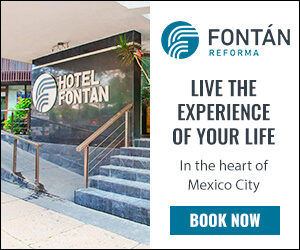
Sojern’s creative analysts also decided to test the use of sales badges, such as “Book Now & Save” to see if it resulted in better performance. We found that ads with a sales badge resulted in a 15% search rate increase on the customer’s website with a comparable click-through rate. However, since the test’s click-through rates were similar and the conversion rates didn’t reach statistical significance, we didn’t find any significant difference between ads that had a sales badge on them or not.


4. Stick to The Ad Photo Limit
As the world becomes more visually engaging, ads with multiple images are a main focal point for many marketers. With that, the Sojern creative analyst team wanted to test whether the number of images shown in animated HTML5 ads had an impact on performance. The original hypothesis was that five images would show more of the hotel’s property and result in higher engagement than showing only three images. However, the results showed differently. We discovered that having five images in the ad, resulted in a 12% lower click-through rate. As a result of this test, we now recommend a max of three images in any animated HTML5 banner ads.

5. Don’t Ignore Localization Subtleties
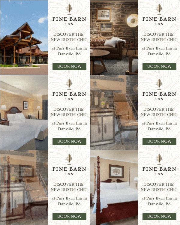
CTAs (call-to-actions) are, of course, the main reason behind every ad. You want your potential customers to book directly from your website after following your ad. The creative analyst team decided to test the classic “Book Now” against a CTA that focused more on the discovery phase, “Start Planning.”
In the United States and Latin America, the CTR didn’t vary much between the two. Sojern saw only a 0.35% increase in the CTR for “Book Now.” While there is no significant CTR difference between “Book Now” and “Start Planning” creatives, “Book Now” had a 12% increase in conversions over “Start Planning.” Based on these results we recommend hoteliers in the United States and Latin America stick with the CTA “Book Now.”
The Asia Pacific region, however, saw different results. The CTA, “Start Planning” resulted in an 11% higher CTR than “Book Now” and an 88% increase in conversions. This upper funnel phrasing had a profound impact on the region and the performance of their ads, because of this we now recommend all Asia Pacific hoteliers use “Start Planning” as their CTA.


